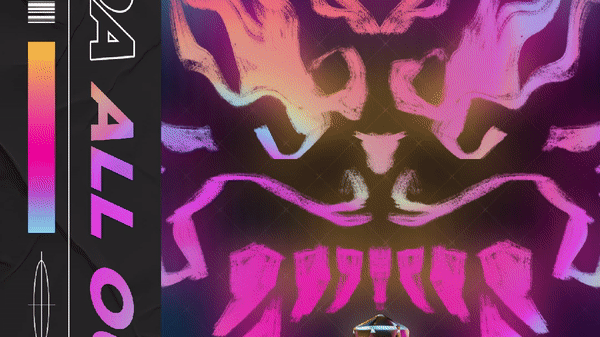
Problem: Dragon Adventures' (DA) old UI broke the player's immersion with a cluttered, flat 2D UI that was inconsistent with the game's 3D world. The iconography also felt disconnected from the visual style of the game, and there were issues of legibility due to poor contrast and padding through the interfaces.
Solution: Redesigned the UI, refreshed iconography, and revisited UX for most screens. Also art directed and implemented new icons to match the new visual style.
Tools Used: Roblox Studio, Photoshop, Illustrator
Background: Dragon Adventures is a fantasy adventure RPG by Sonar Studios for children 8-16. The game has over 682.7 million play sessions to date and averages roughly 5-10k concurrent players daily. DA was created during the 2017 Roblox Accelerator program.
Reworking the old, Designing the New
The client first provided low fidelity wireframes beforehand that contained required UI elements and a rough layout in which I reviewed and revised accordingly.
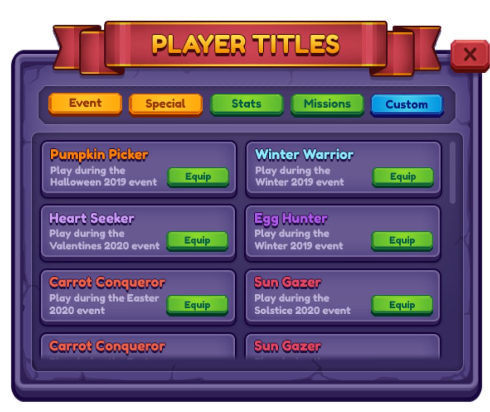
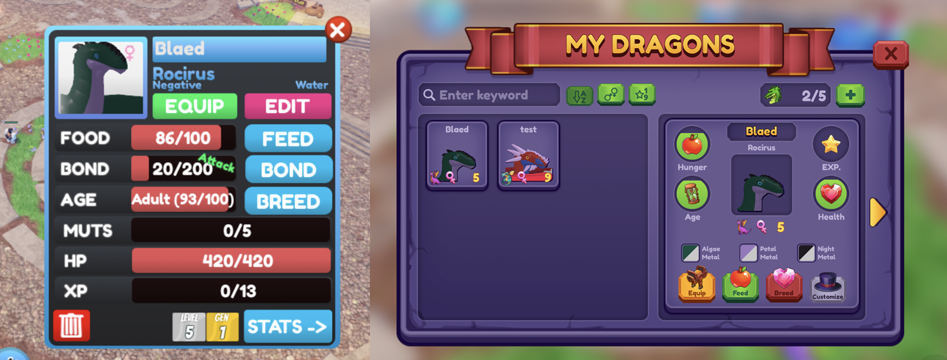
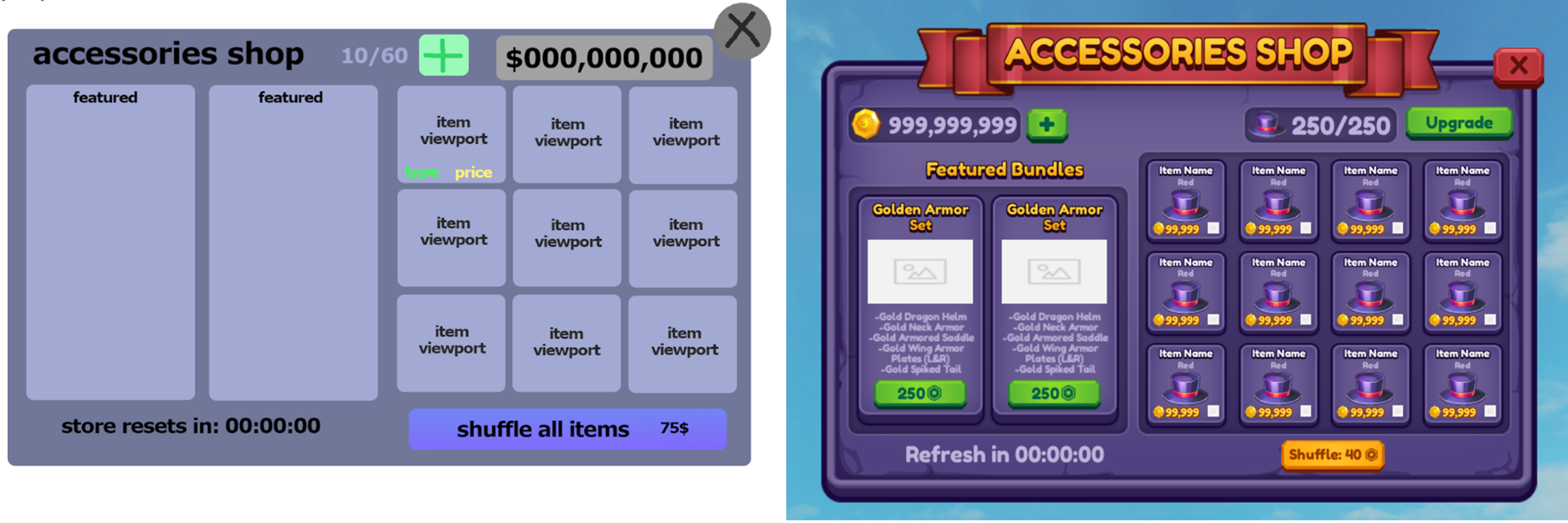
For the visual design, I wanted to go with a medieval, fantasy-ish stylized with matching iconography and typography. With the new wireframes and design, I implemented all screens into Roblox Studio animation-ready for the programmer.
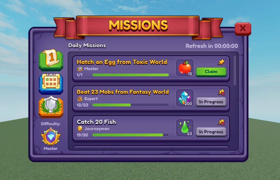
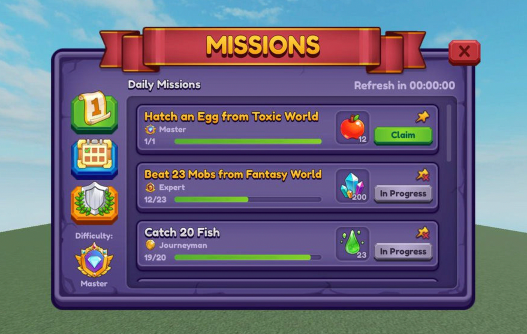
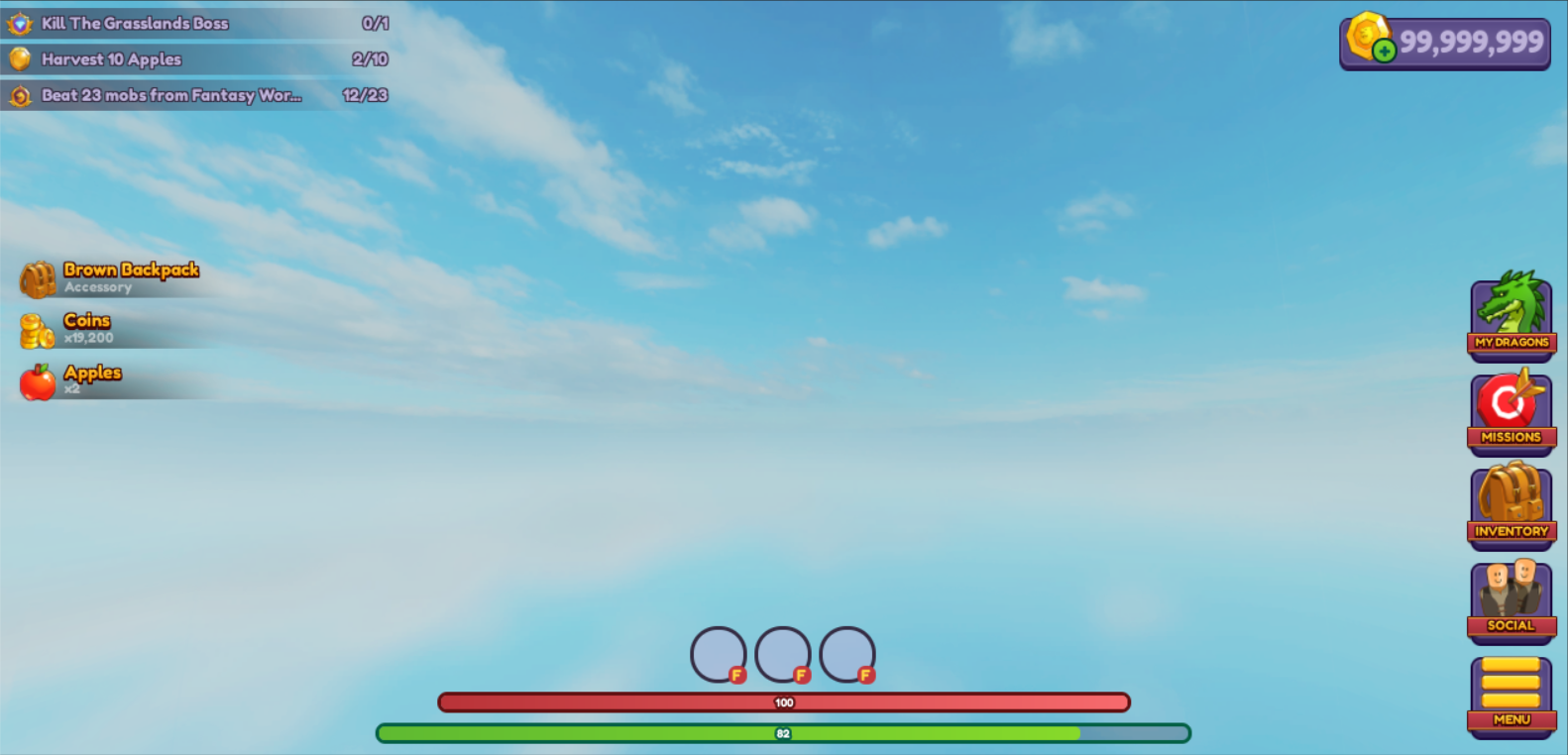
Reworking the HUD
Because of the lack of consideration in the information hierarchy in the original design, the HUD became too intrusive and cluttered. To tackle this issue, I condensed and rearranged the information while sacrificing no crucial information. Additionally, the team and I worked on a responsive design based on the device screen size.
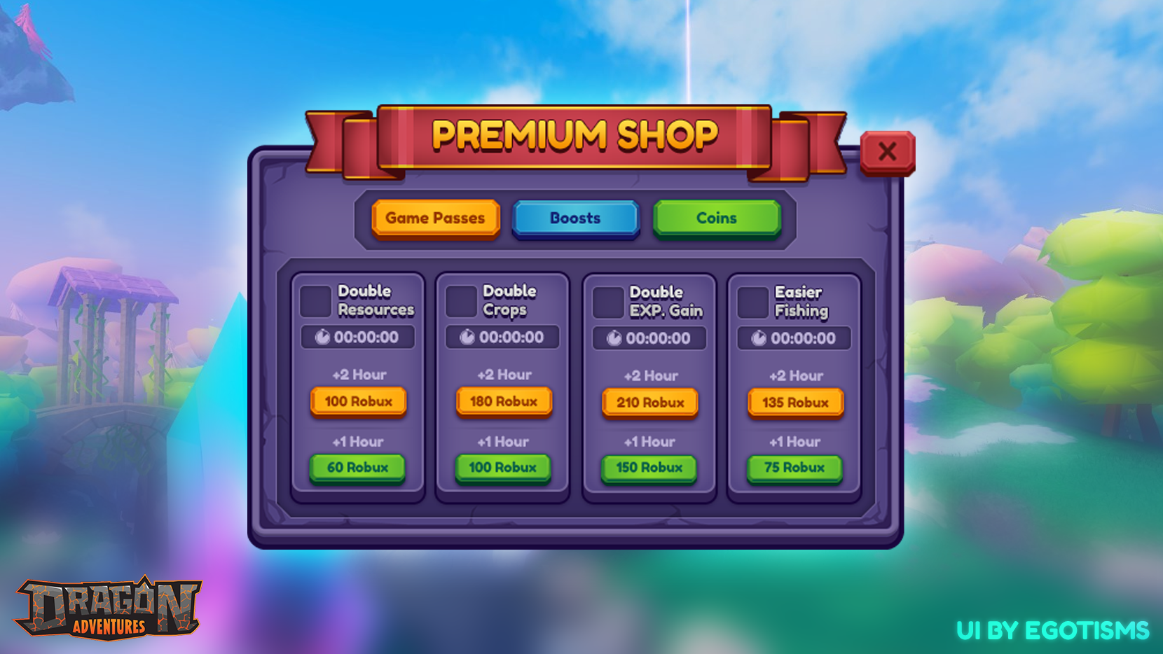
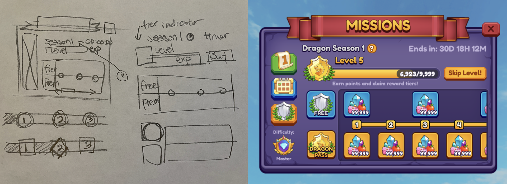
Spotlight - Season Pass:
The Season Pass was a new feature I had to design from scratch. I had to compact information, maintain hierarchy, and make it appealing to entice players as much as possible. The layout was drafted on paper and then continued in Photoshop, which was taken into Studio and finalized. I reduced the information displayed by implementing icons that conveys information effectively.
Conclusion
Dragon Adventures had an existing community that was very loyal to the original vision of the game. I had to make sure all UX changes I made did not interfere with the existing player-to-game interactions. This was quite the challenge as I had to address UX issues that the players got used to. All in all, the redesign was positively received and feels much more dynamic and connected with the existing environment of the game.
Check out Dragon Adventures to see and interact with the real work!