Problem: The developers of Twilight Daycare (TD) wanted a complete overhaul of their existing UI to match the new branding. The original UI had clashing colors, messy layouts, and overall poor contrast. The UI also lacked character and did not relate to the theme much. The iconography was outdated, inconsistent, and did not convey information well.
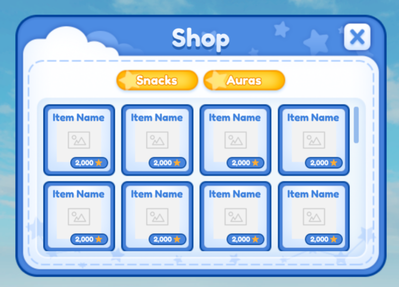
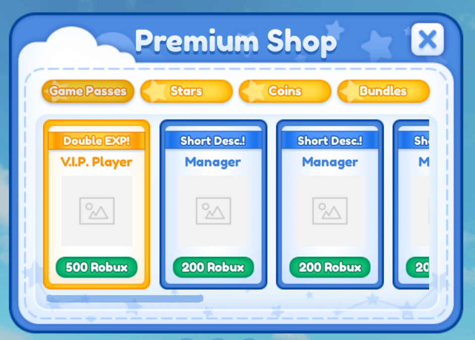
Solution: Created a visual language that connects the game with the new branding and unified all screens under one theme. Art directed and implemented new icons throughout the new interface and imported all interfaces into Roblox studio.
Tools Used: Roblox Studio, Photoshop, Illustrator,
Background: Twilight Daycare has over 1.9 billion play session and 228 million unique play sessions to date. TD at its peak was one of the top 10 Roblox games for overall CCU. TD is the highest visibility game I've worked on to this day.
Conceptualizing the New Design
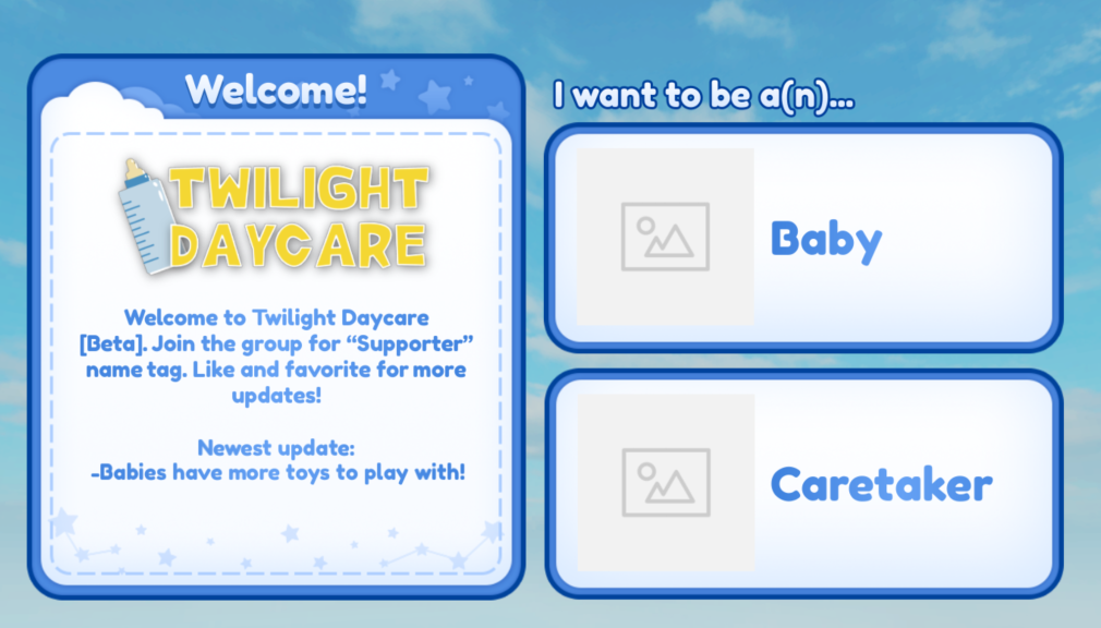
The client wanted the UI to feel dreamy, cartoony, and blue to match with the "twilight" aspect of the game. After initial briefing, I mind-mapped elements that related to the game's name and concept. I then modified my ideas to fit the client's desires and translated them into sketches on paper.
I ended up with a design with stars/constellations, clouds, dotted lines, and an outline to give a more playful but soft feel to the overall design.
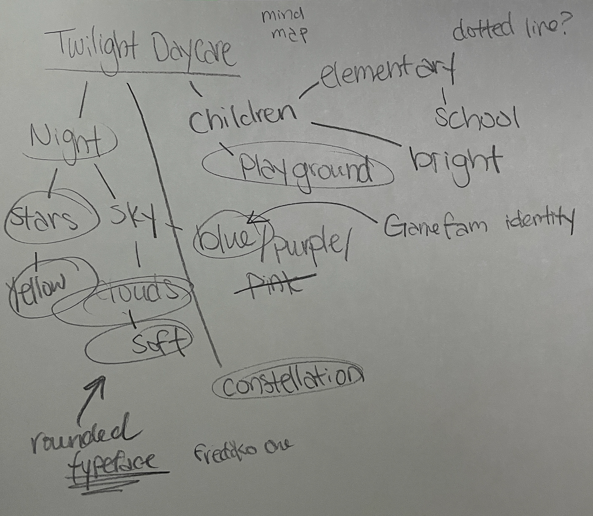
Mind map of Twilight Daycare
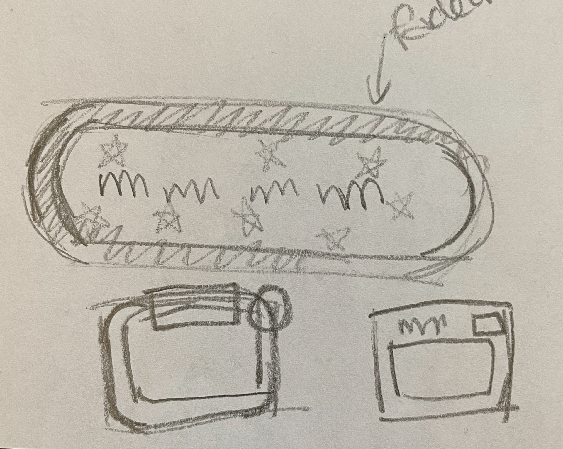
Early stage shape-building
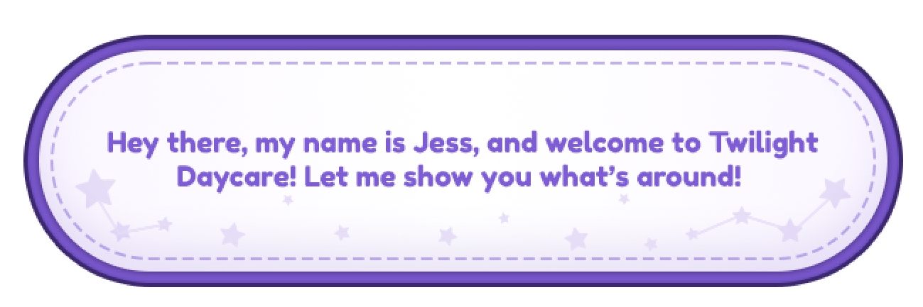
Initial UI theme draft
Conceptualizing the New Design
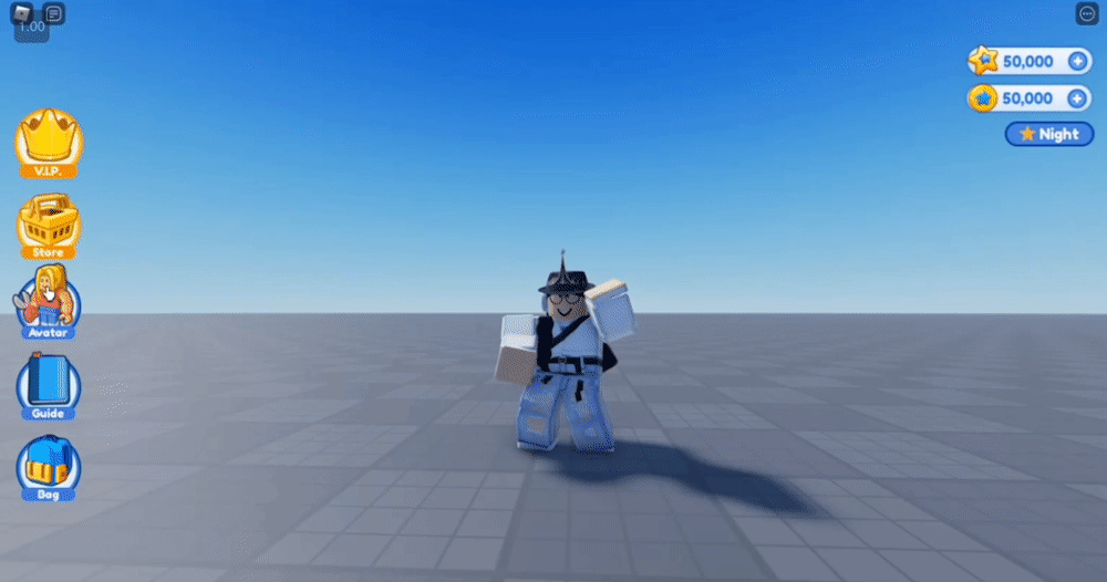
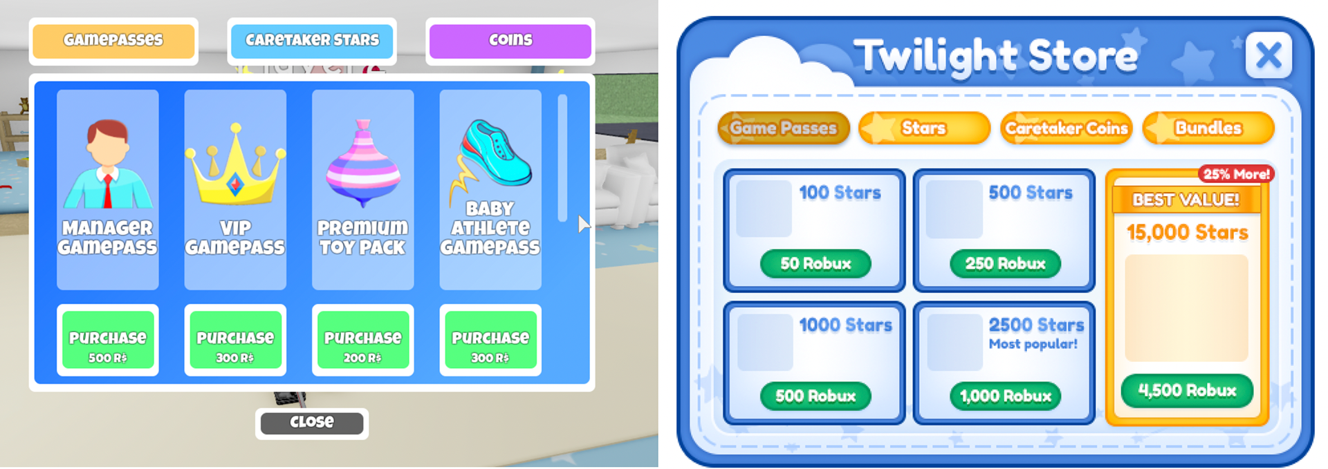
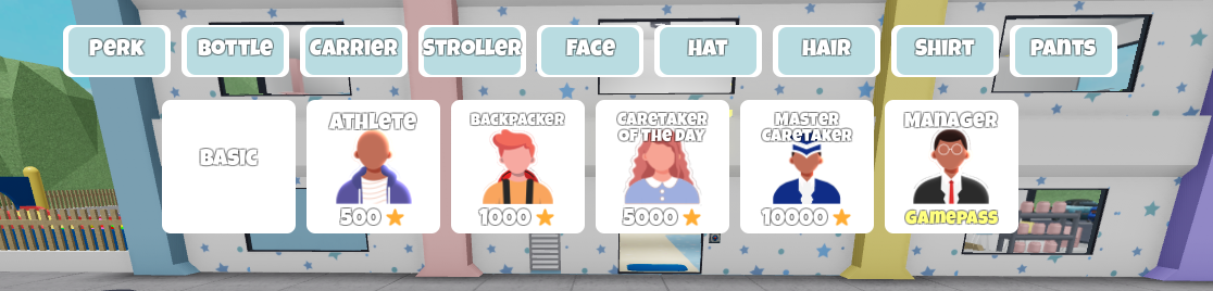
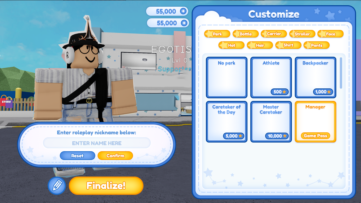
Twilight Daycare's initial character customization system was barebones and lacked the layout of a conventional editor familiar to the target demographic. Additionally, it lacked information like currency counters since some selections double as transactions. The editor also did not include the character renaming feature, which is a crucial mechanic to roleplaying games on Roblox.
I addressed these issues by consolidating the tabs and selections to one frame and integrating the roleplaying name mechanic into the UI. Additionally, I added currency counters to the UI top right for better transaction experiences.
Conclusion
TD was a really fun project to work on since I really enjoyed working with this theme. Some screens were a challenge to create because the system and it's neighboring mechanics inherently connected UX issues, making it difficult for me as a designer to figure out a fix without forcing the client to redevelop their systems.
The final product took longer than expected to implement because the client needed time to redevelop certain mechanics, but these changes ensured that all future users had the best experience in game.