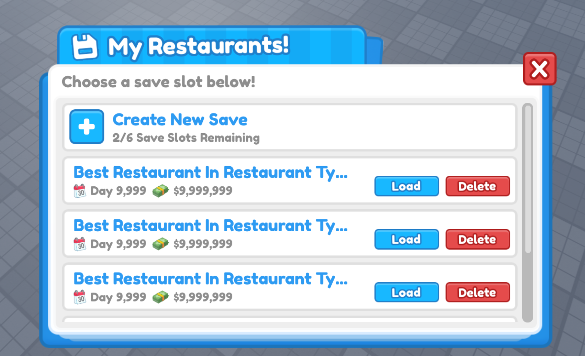
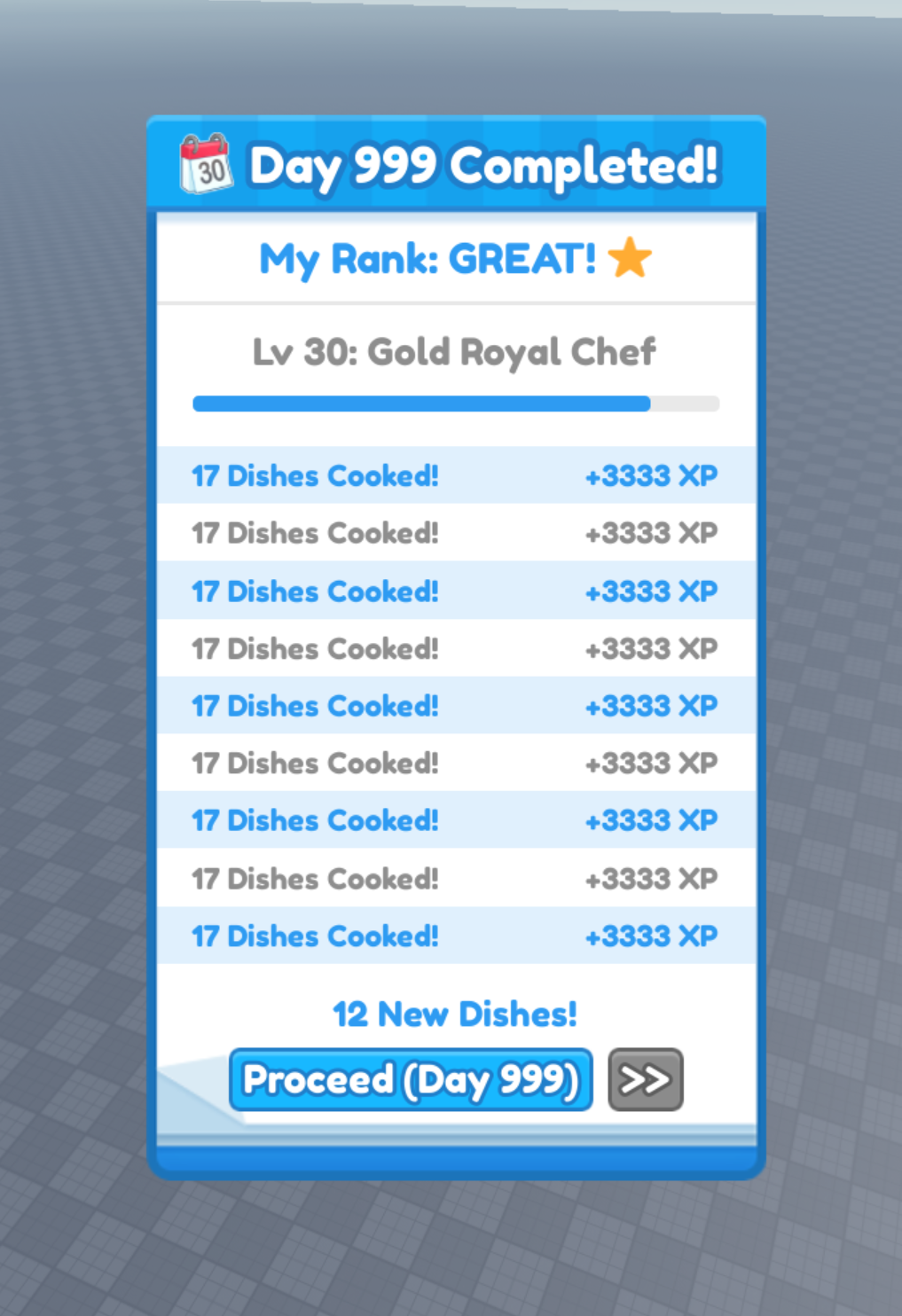
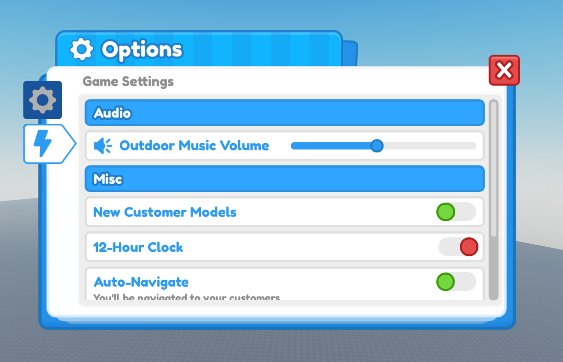
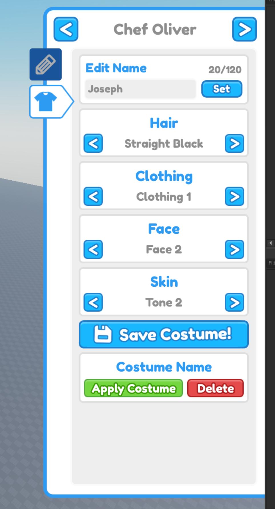
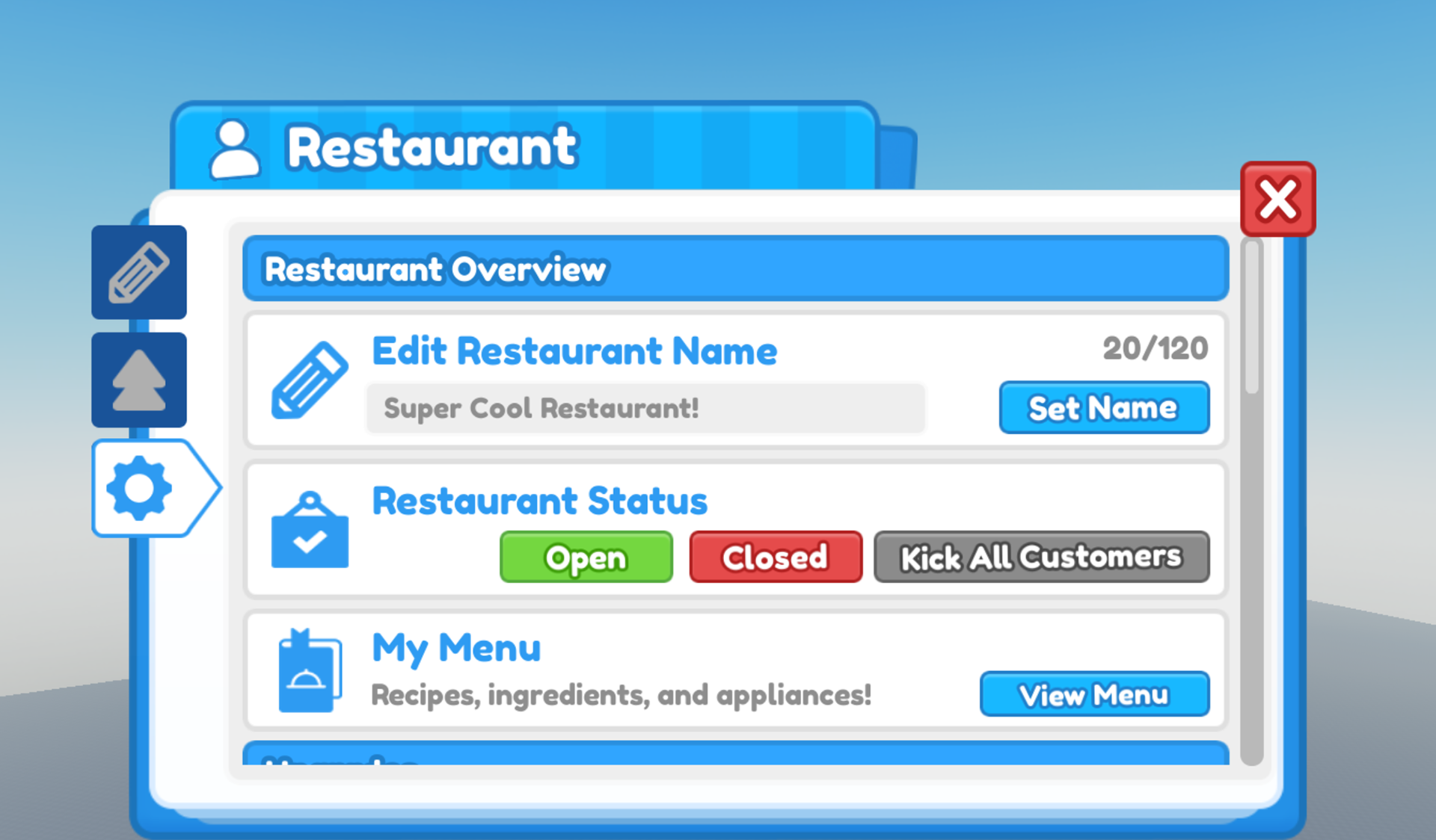
Problem: Restaurant Tycoon 2 (RT2) needed a user interface overhaul. The old UI was visually inconsistent and lacked personality. Existing iconography were not cohesive or visually appealing. Lastly, there were UX issues that made core mechanics tedious to interact with.
Solution: Redesigned the UI, refreshed iconography, and revisited UX for most systems. Art direct and implement new icons to match the new visual style.
Tools Used: Photoshop, Illustrator, Roblox Studio
Background: RT2 is the second installment to the massively popular classic title on Roblox. The game boasts over 1.1 billion play sessions and averages roughly 5-20 thousand concurrent players daily. RT2 was created during a Roblox Accelerator program and I was asked to overhaul their UI in Q4 2021.
Creating the new Visual Design
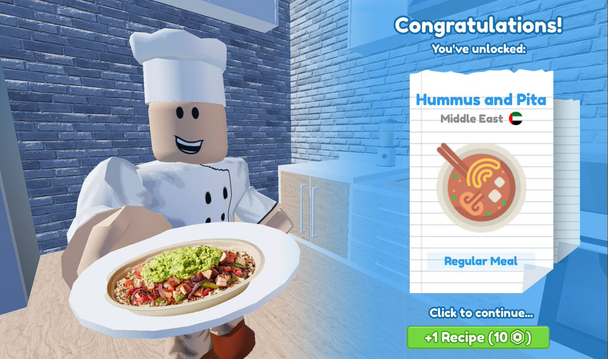
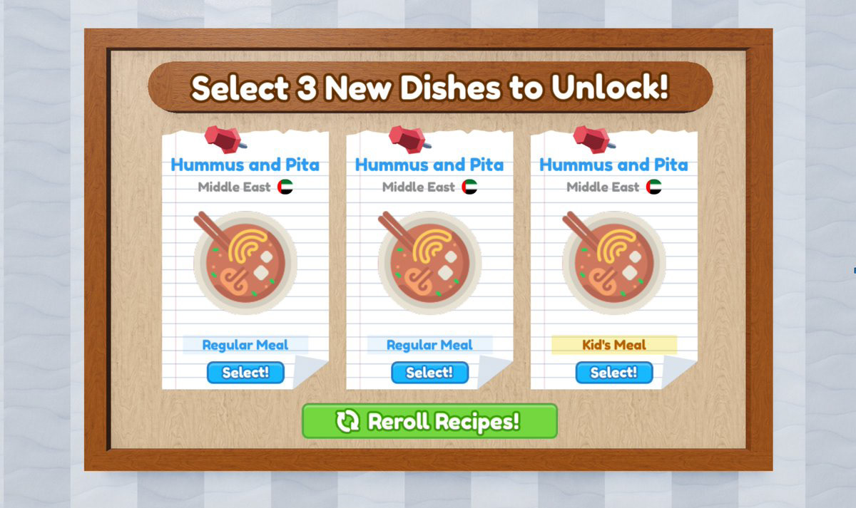
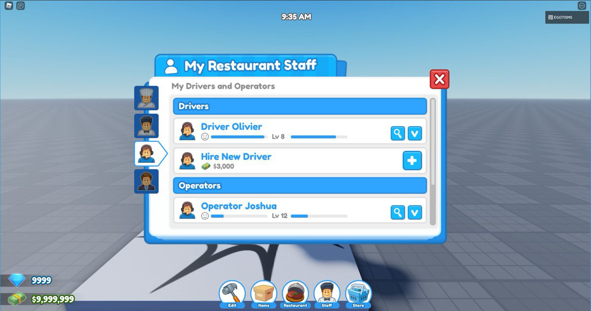
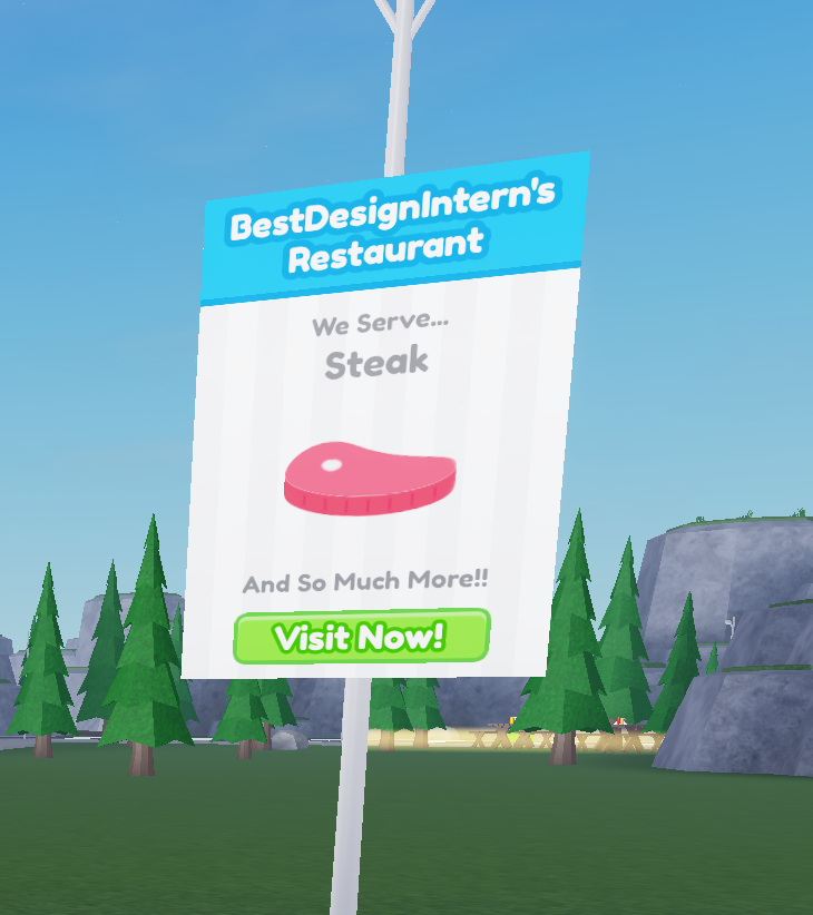
Because Restaurant Tycoon 2 was an existing game, some screens only needed a visual revisit while other screens needed a UX overhaul. The developers wanted to keep the modern motif along with the blue, red, green accent. After determining a visual language, all screens were updated to the new style along with new UI icons.
Experimenting with Programming UI Animations
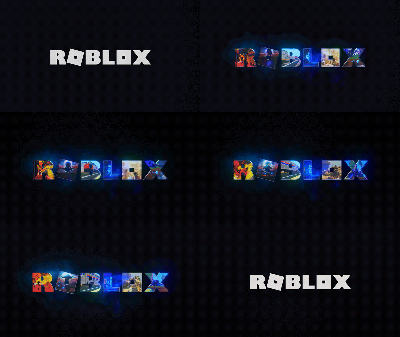
While I worked on implementing the new UI, I also experimented with UI animations that adds a new layer of personality to my designs. I programmed this animation with Luau in Roblox Studio but deemed it too flashy to actually use in experience.
Spotlight - Painting Furniture in Build Mode
One of the biggest UX issue in RT2 was paint mode in build mode. Furnitures have a primary and secondary color along with material. Players are given an array of choices for each category and could only paint one category per click. This lead to extremely redundant and tedious interactions for a very important mechanic of the game.
In the old system, painting 5 chairs meant selecting one color category, clicking 5 chairs, and repeating that for two other categories, which would take 18 clicks.
My solution introduced multiple selection, which allows users to select for all 3 categories to quickly paint furniture items. Thereby improving the efficiency especially for players heavily invested in customization.
Painting 5 chairs in the new system now requires 3 clicks for all three color selections and then one click per chair, for a total of 9 clicks.
Conclusion
RT2 was the biggest project I've worked on. There were somewhere from 50-70 frames to design, some of which needed complete UX overhauls. But, it meant that I was able to work on a variety of gameplay systems that challenged me to design solutions within the Roblox UI engine. RT2 is one of my favorite projects that I hold dear to my heart.
Check out Restaurant Tycoon 2 to see and interact with the real work!
