Problem: Supercharged! needed a new UI designer to redo existing and complete missing interfaces the game needed. Supercharged! previously had some UI designed, but it was very minimal and did not match the game's aesthetic at all.
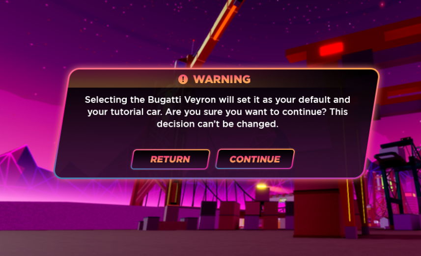
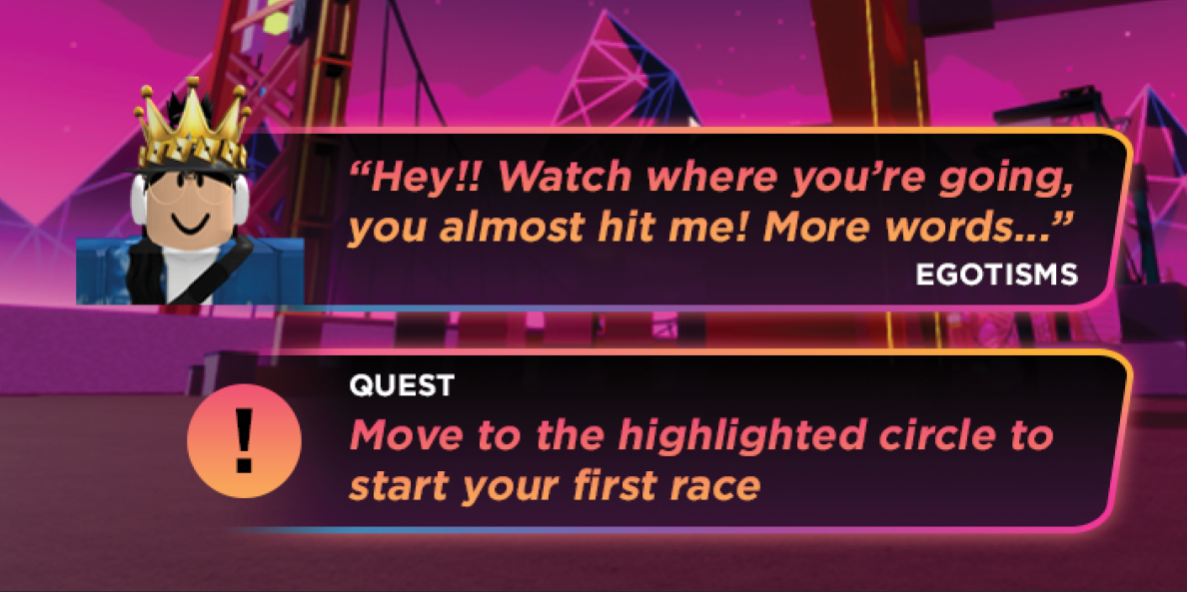
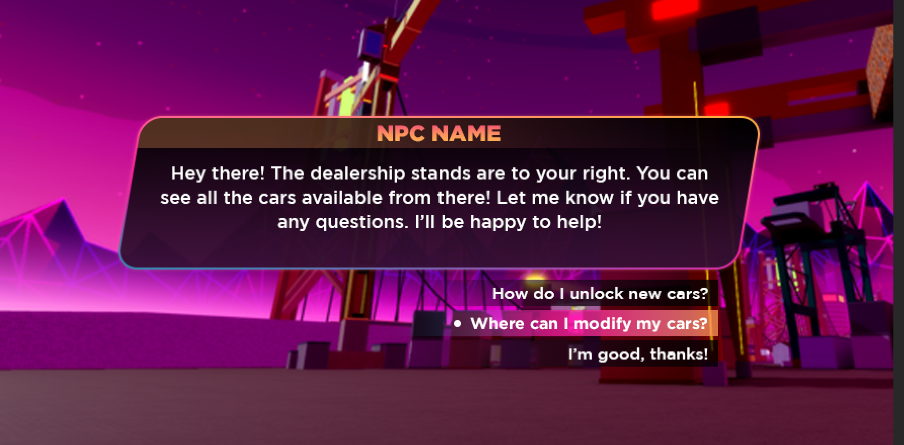
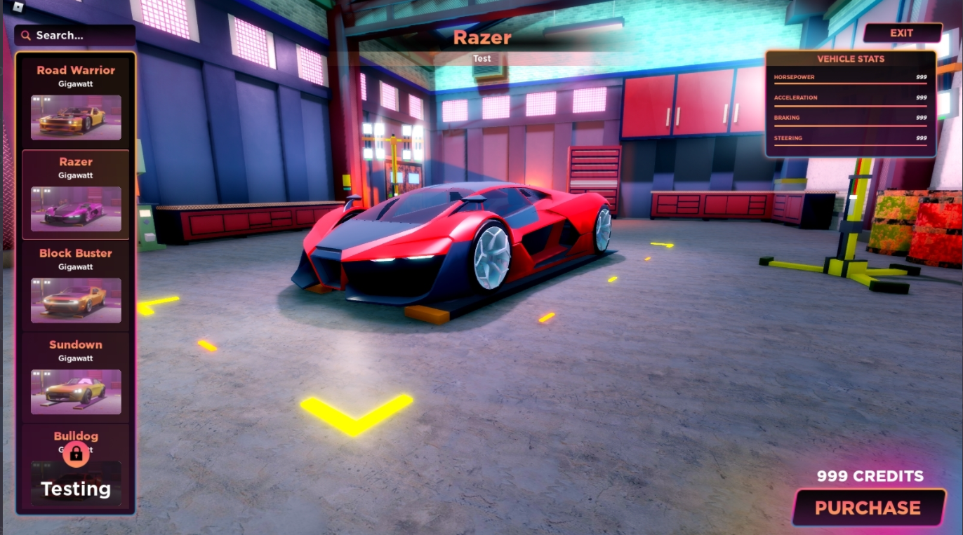
Solution: Revisited existing screens and developed a new visual style. Wireframed, designed, and implemented missing screens and import work into Roblox Studio.
Tools Used: Photoshop, Roblox Studio
Background: Supercharged! is a racing simulation game targeting boys 6-16. The game is a Roblox accelerator project integrated into GameFam and has been yet to release. This is the first racing game I've worked on.
Creating a New Visual Style
Because there was already existing UI, the client was unsure if they wanted a new visual style or continue with the existing design for convenience's sake.
I looked at the environment design and overall game concept. At nighttime, the atmosphere shifted to a vaporwave aesthetic, and I thought that could be integrated into the UI well. Additionally, I opted to italicize and shear certain elements to add to the edge and personality Supercharged! needed.
Spotlight - Spawn Location
The spawn location mechanic was inspired by GTA-V's select location UI and animation, so I designed it to accommodate future location additions while maintaining the ability to segue into the animation seamlessly. (Yes, I'm a terrible driver!)
Conclusion
I absolutely loved working on this project since I'm a huge fan of the Need For Speed franchise. The neon colors with the black to dark purple gradient brings out the vaporwave aesthetic in a great way. This is my first time working on a racing game and this visual theme, but I really loved the way my work turned out!
