Problem: Create a concept for an imaginative restaurant and design a logo and menu for the idea.
Tools Used: Photoshop, InDesign, Illustrator
Background: My idea for the imaginative restaurant was a bright and playful ice cream store that specializes in "Build-Your-Own" customizations seen in restaurants like Chipotle, Cava, etc.
Conceptualizing the Design
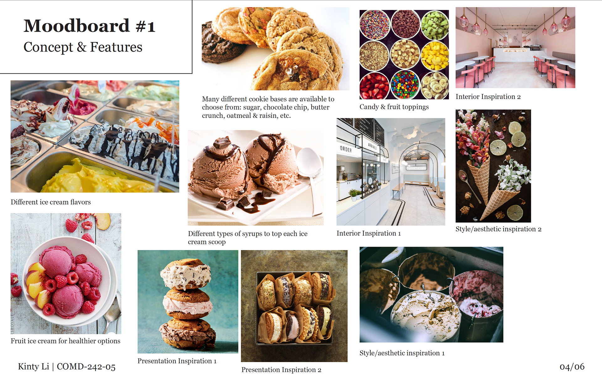
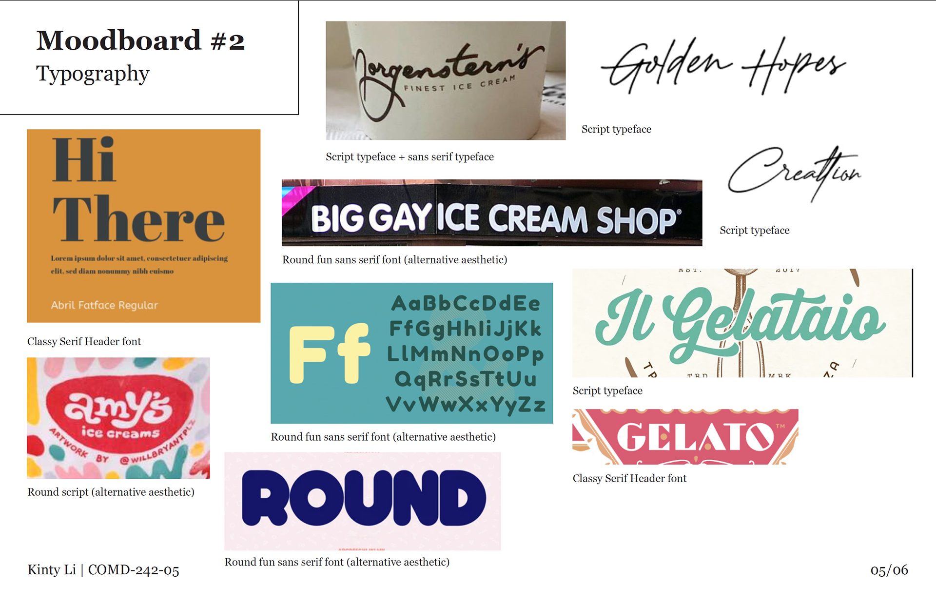
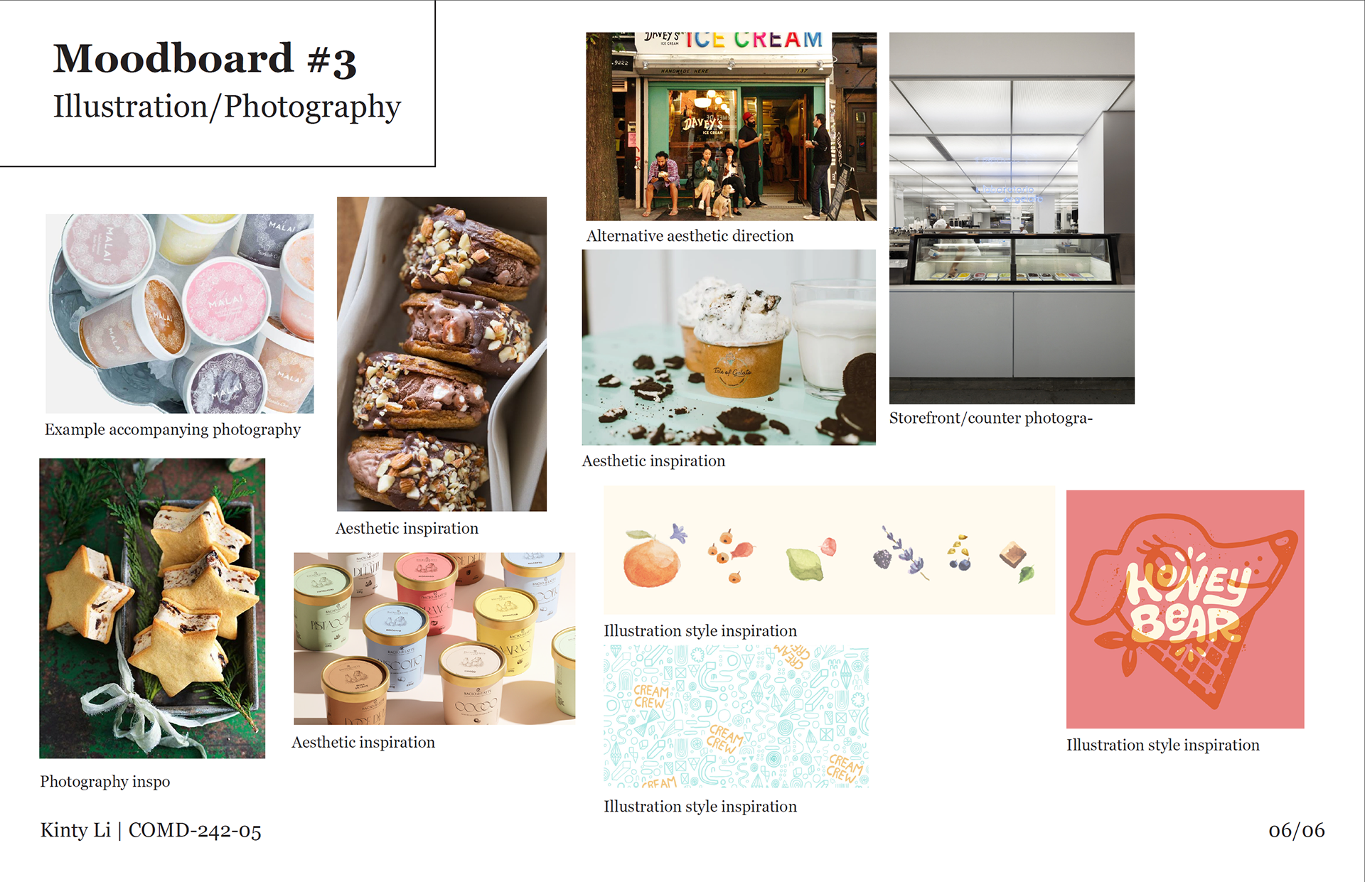
I started with three mood boards to clarify the direction for the typography, concept, and illustrations for the project.
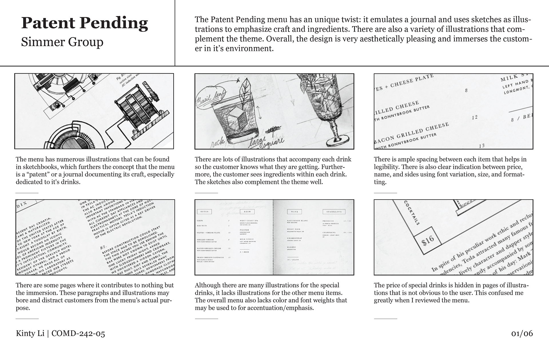
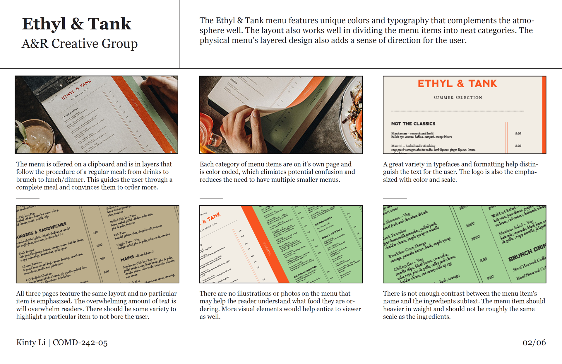
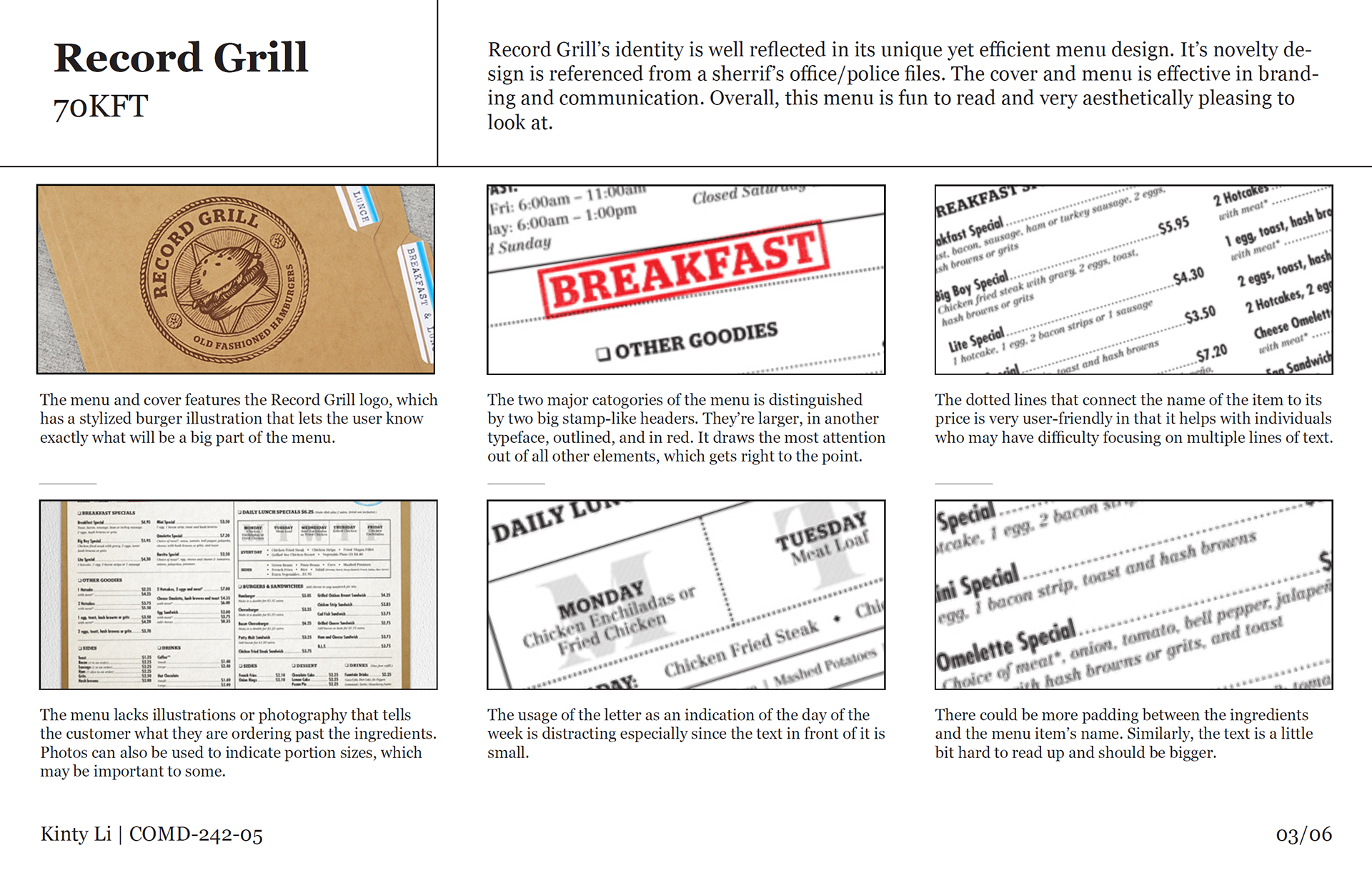
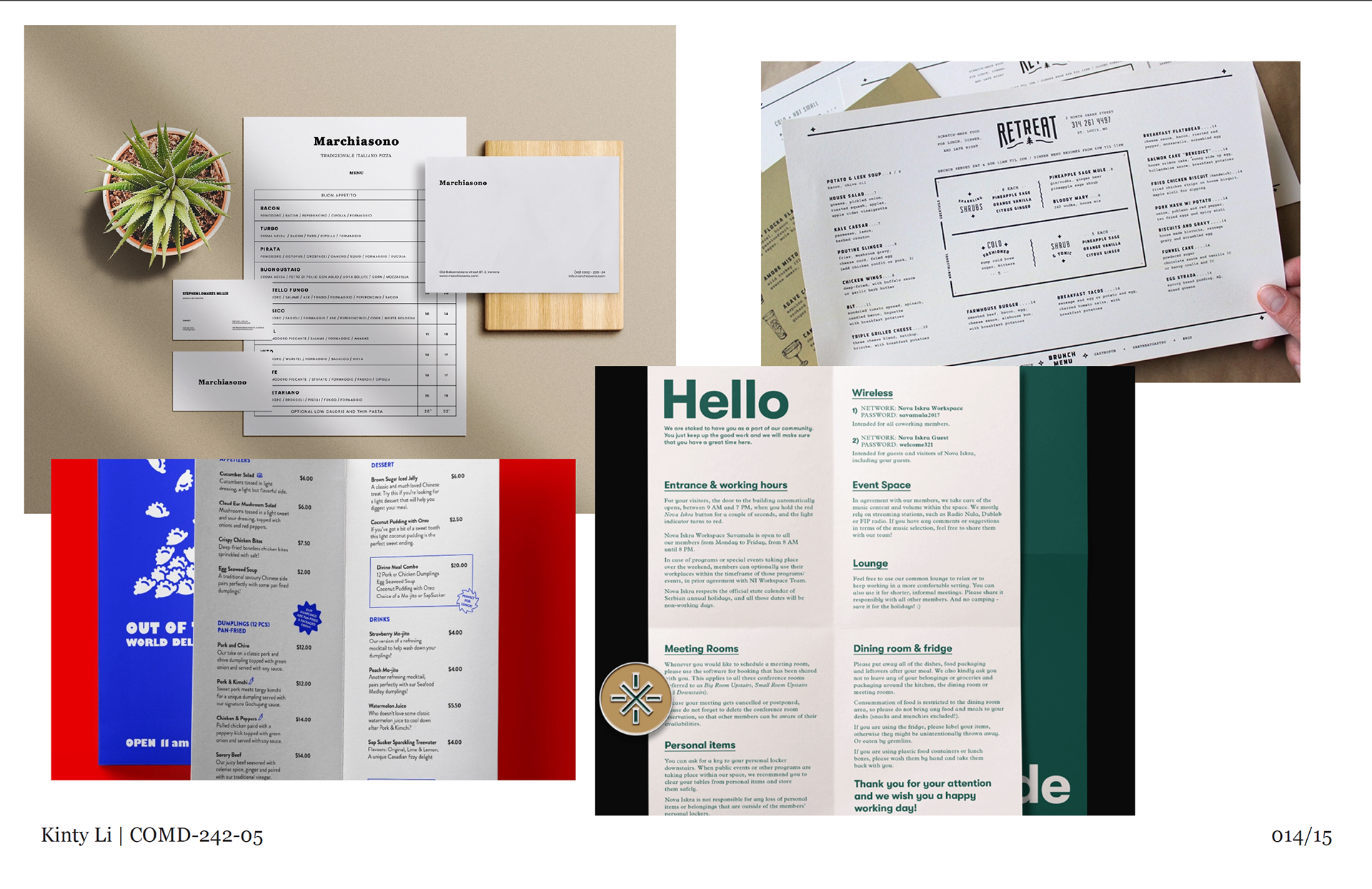
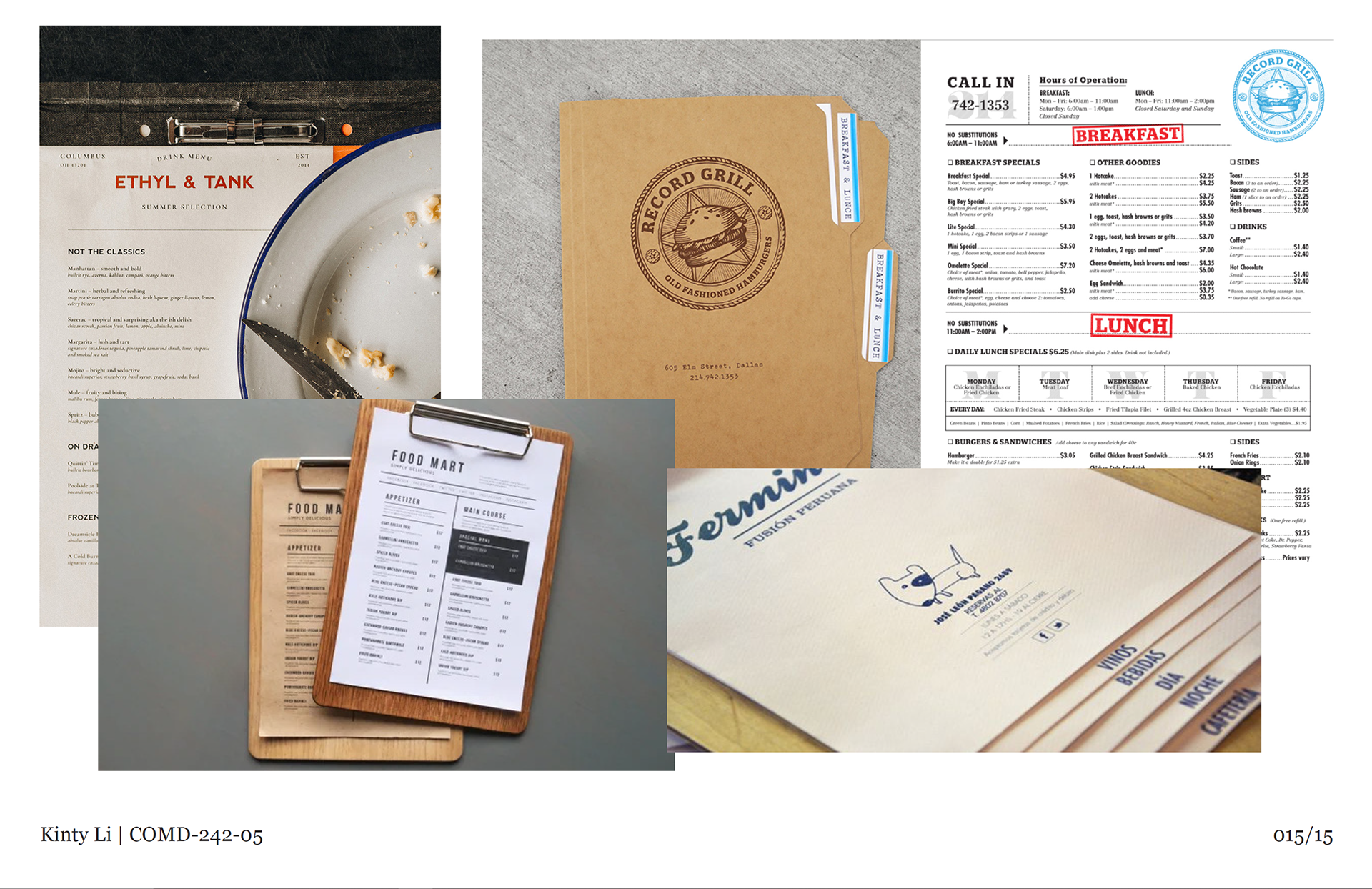
Then, I researched three different menu designs and identified pros and cons to understand the features of a conventional menu. I also created two mood boards for two layout concepts I had in mind.
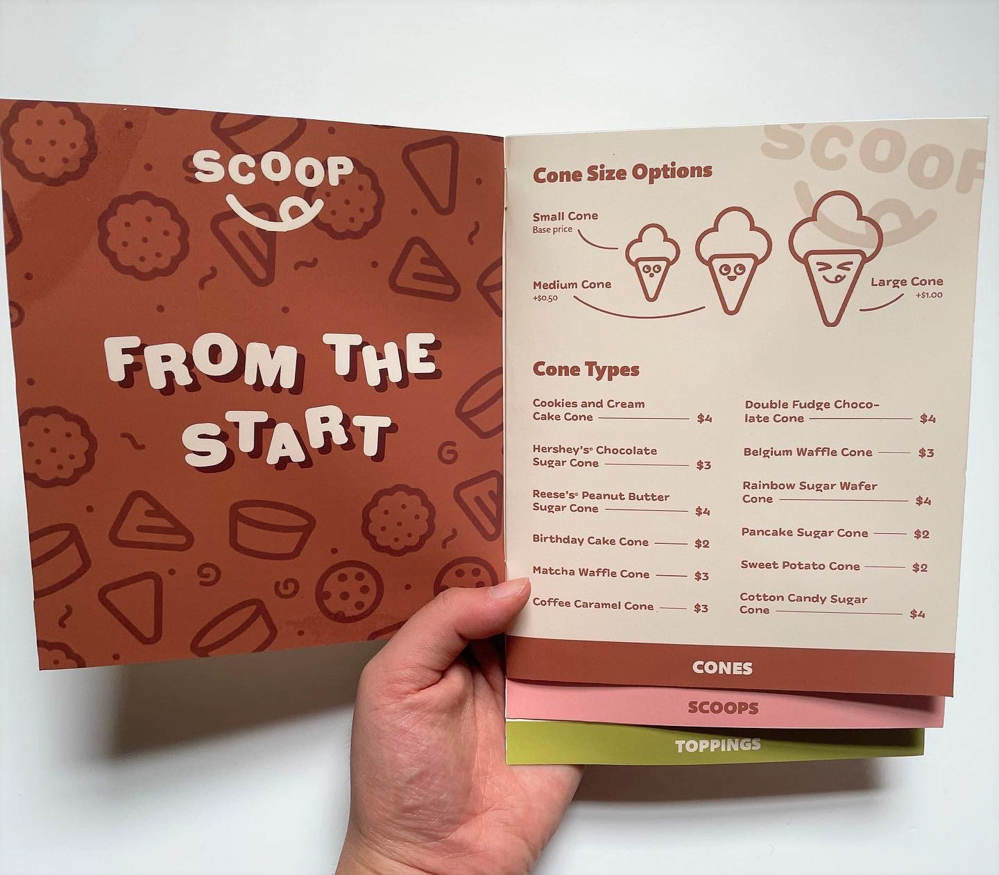
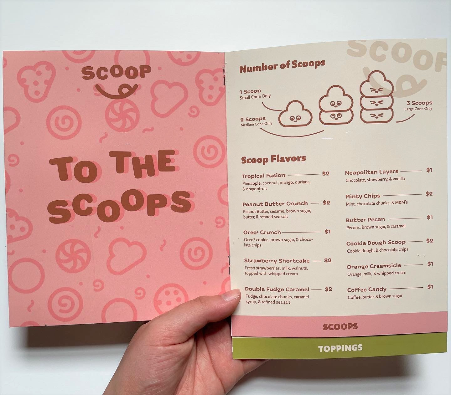
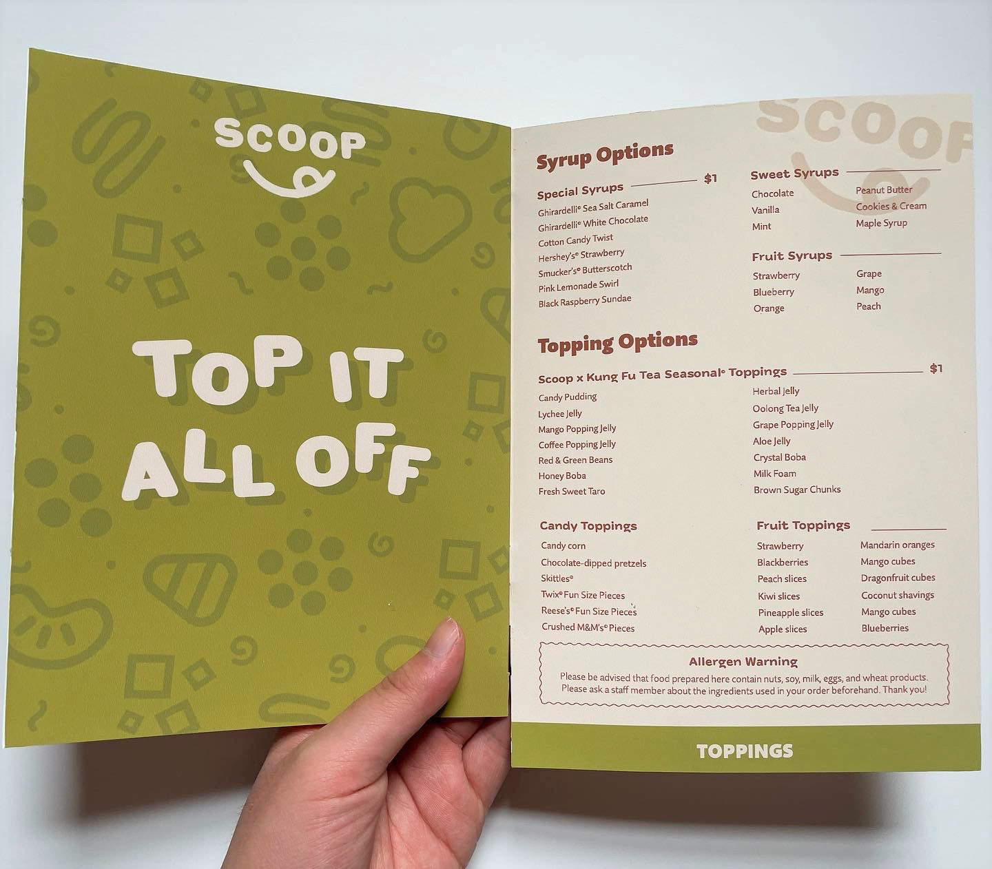
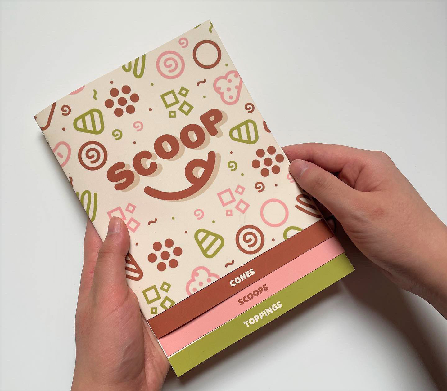
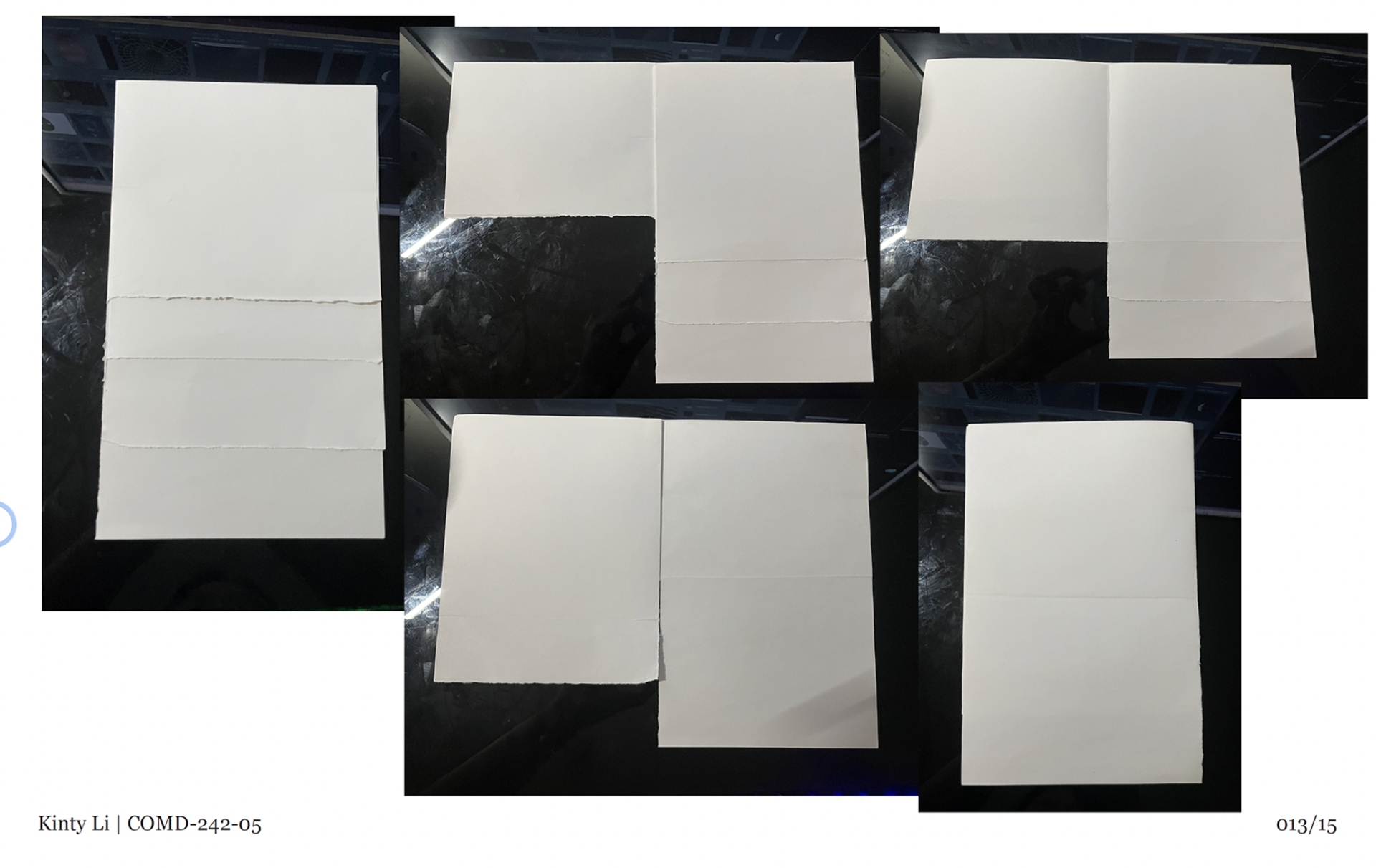
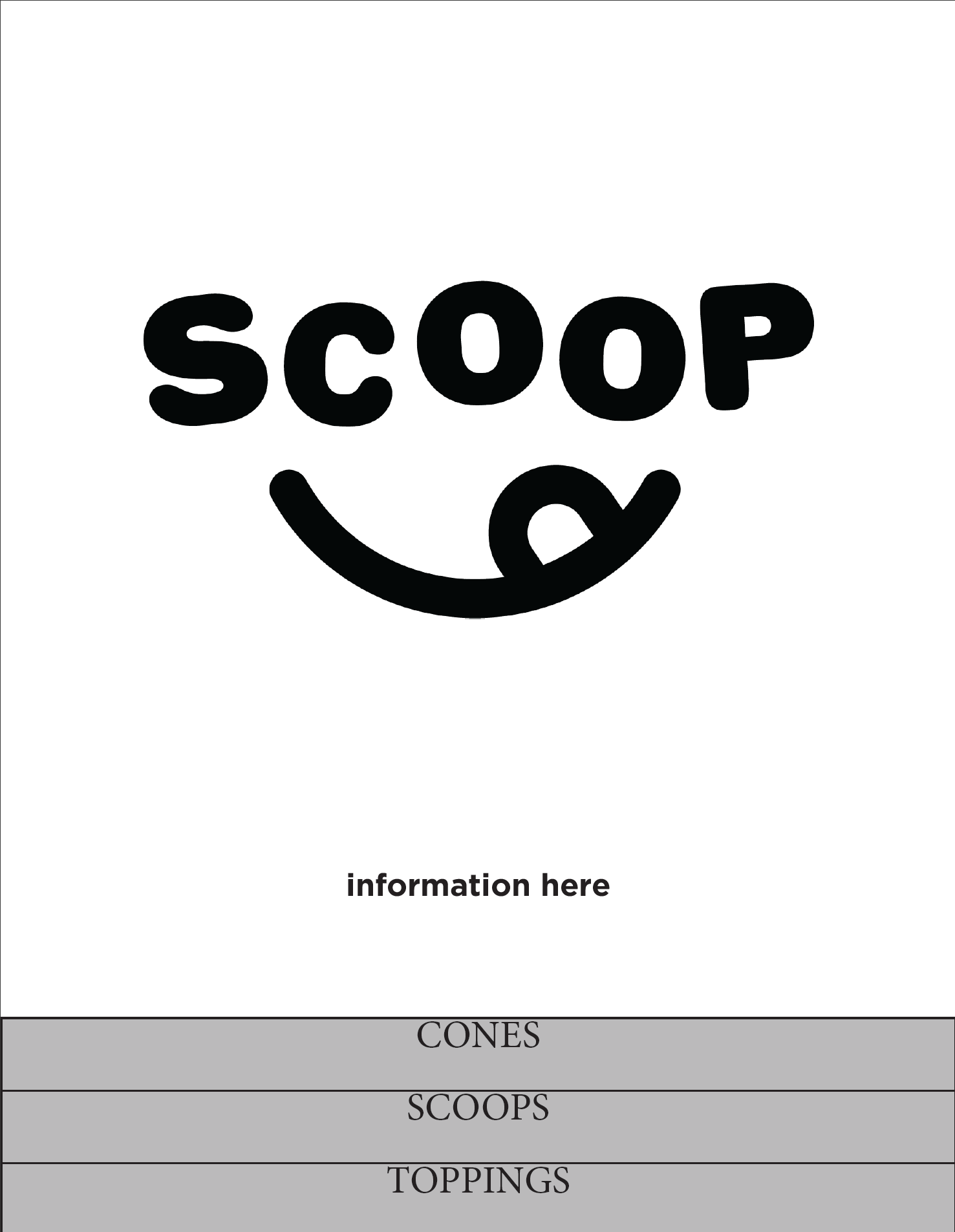
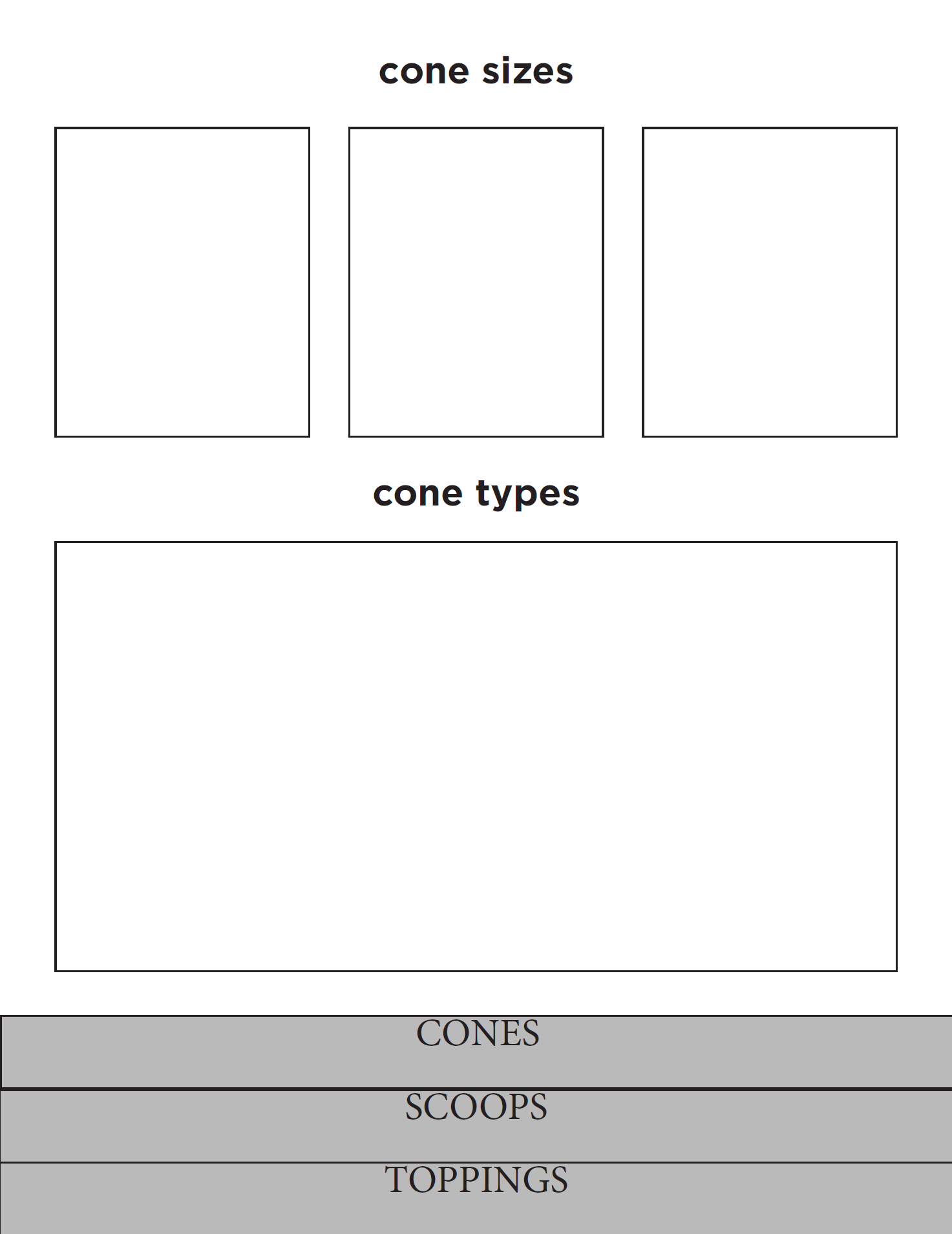
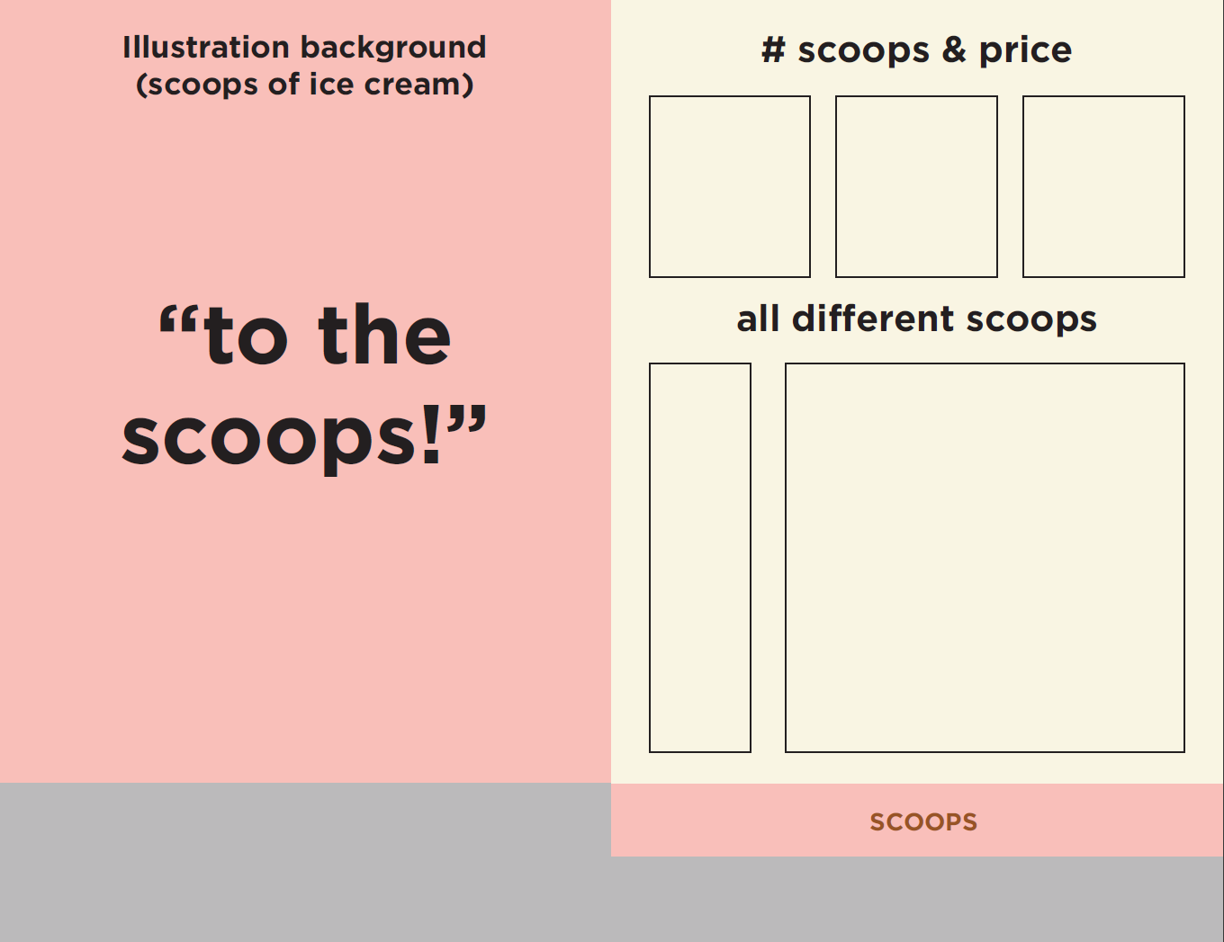
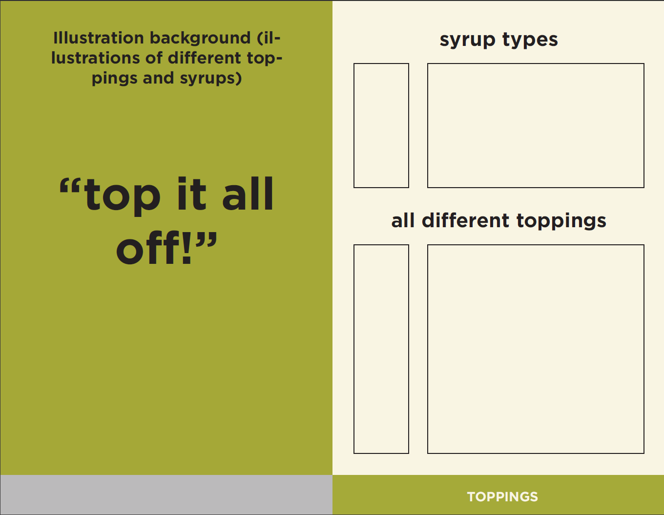
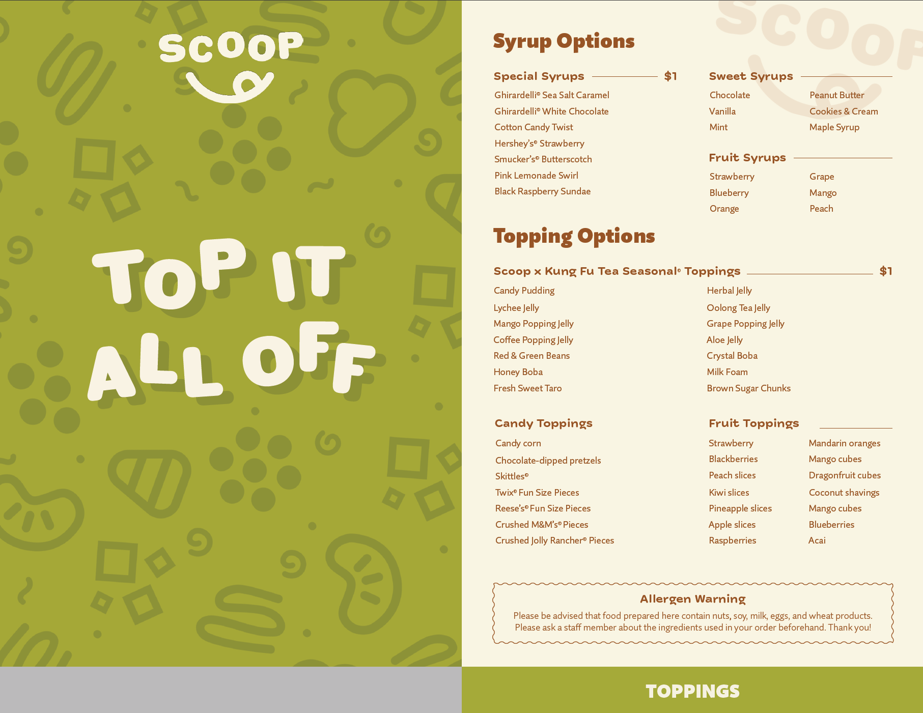
With that, I prototyped a menu layout. My idea was to have the menu have different pages for the different steps of the ordering process. The pages will appear layered, which emulates the imagined process of ordering ice cream in my restaurant. The layered pages will also have navigation tabs at the bottom that will be color-coded and labeled after the step the customers are on.
Designing the Logo
Originally, my concept was to have a "scoop of the day" where the community may have their ice cream order listed as the daily special. The concept was removed because it was impractical and the name was too long. I ended up cutting everything and sticking with "SCOOP".
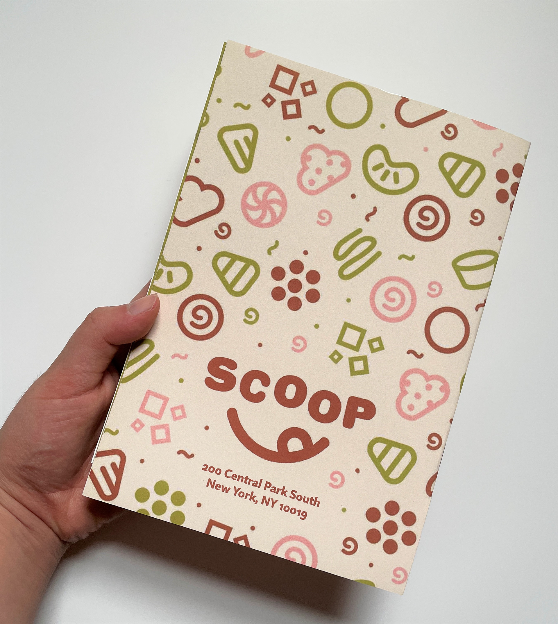
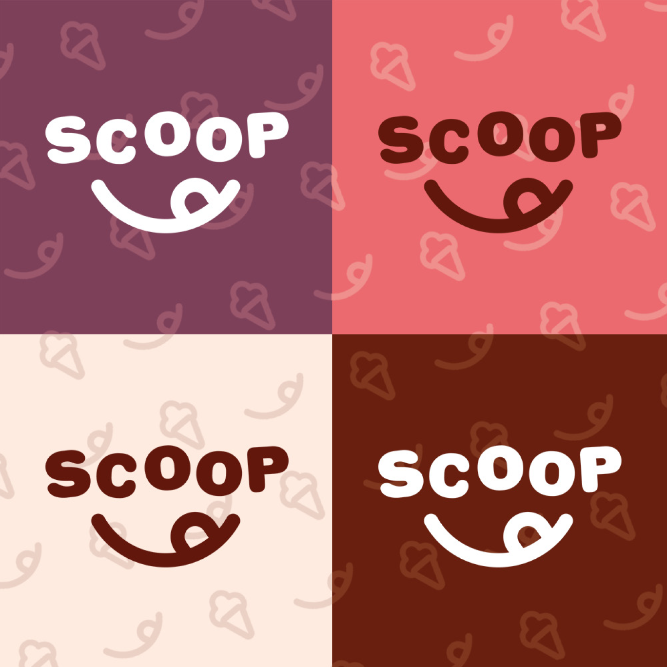
I iterated 12 times on the name and then refined the iterations further into 5 designs that felt much closer to the actual concept. I ended up with the final logo that incorporated a smile and a tongue to symbolize ice cream, licking, and happiness.
Imagining the Color Palette
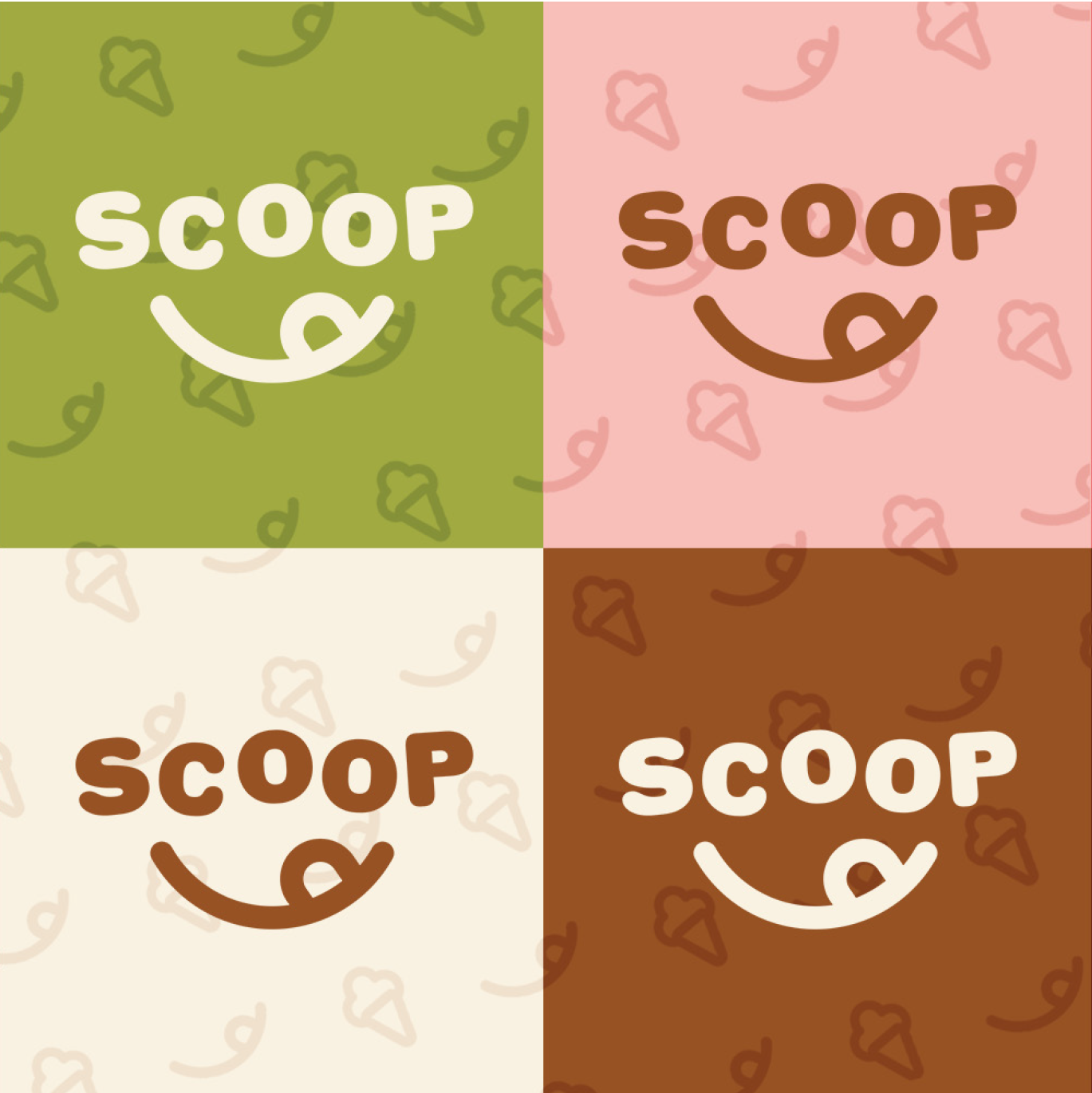
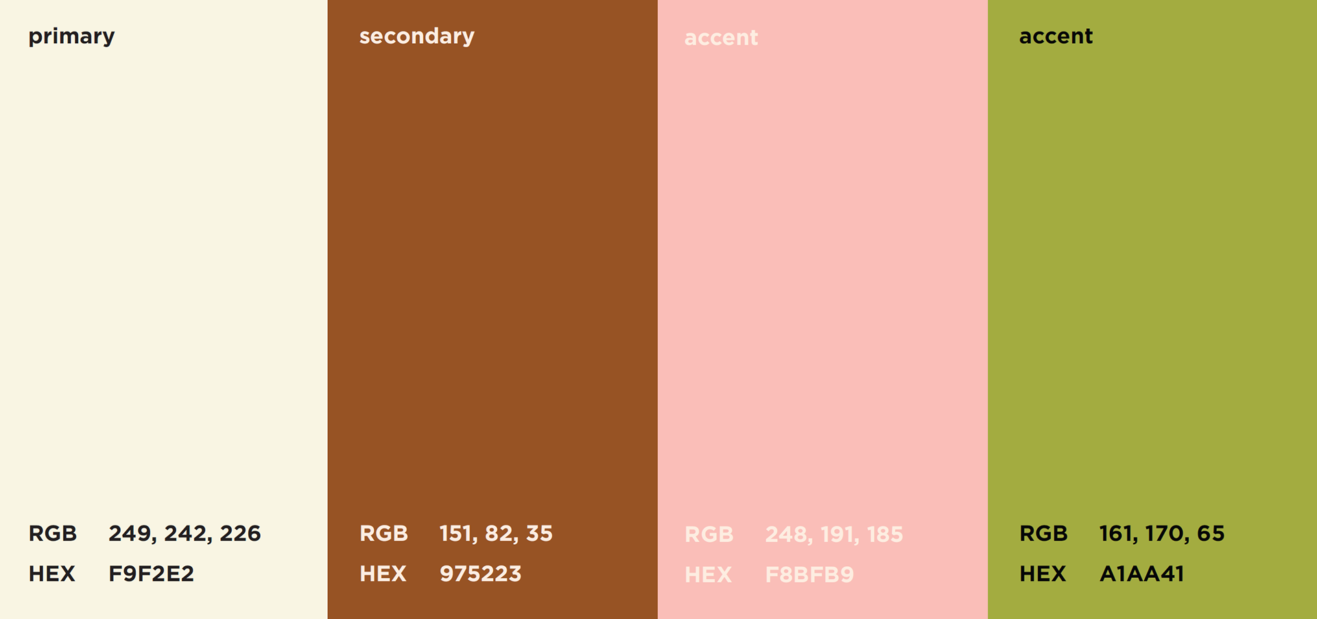
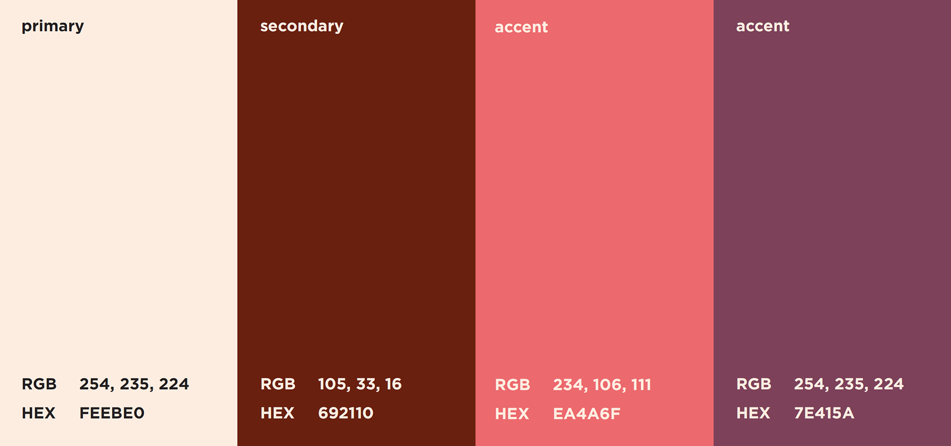
I created two color palettes and a pattern integrated symbols of the brand: the smile and the ice cream. I eventually moved on with the off-white, brown, pink, and green color palette since I thought the colors felt more fun and matched the traditional ideas of ice cream colors. The other color palette seemed a bit too contemporary for what I wanted to work with.
Building the Menu
With my research and mood boards, I created my menu by starting with a low-fidelity prototype and then filling in the information. I then created illustrations for the pages and the covers. I printed the pages, trimmed them manually, and finally binded the menu together.
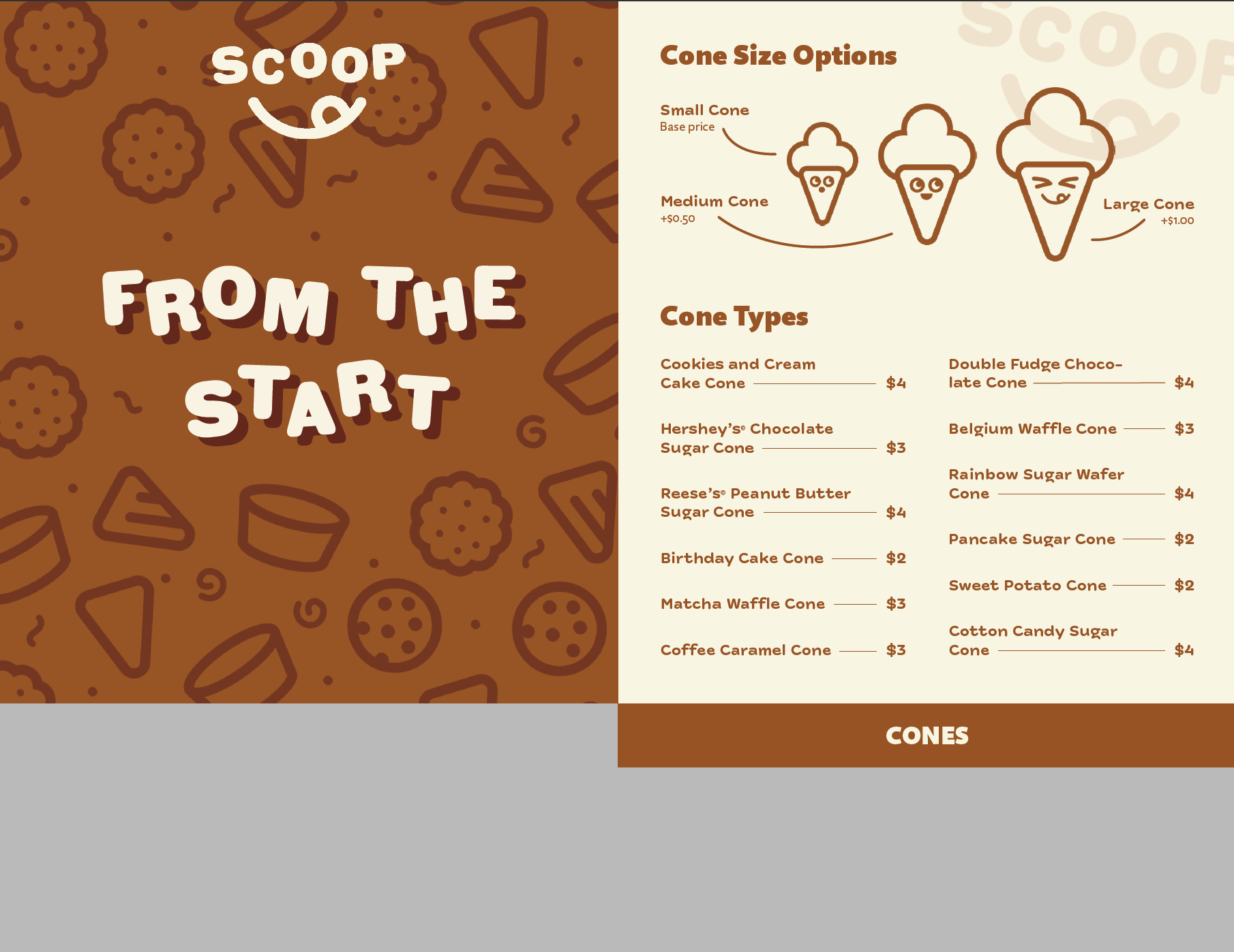
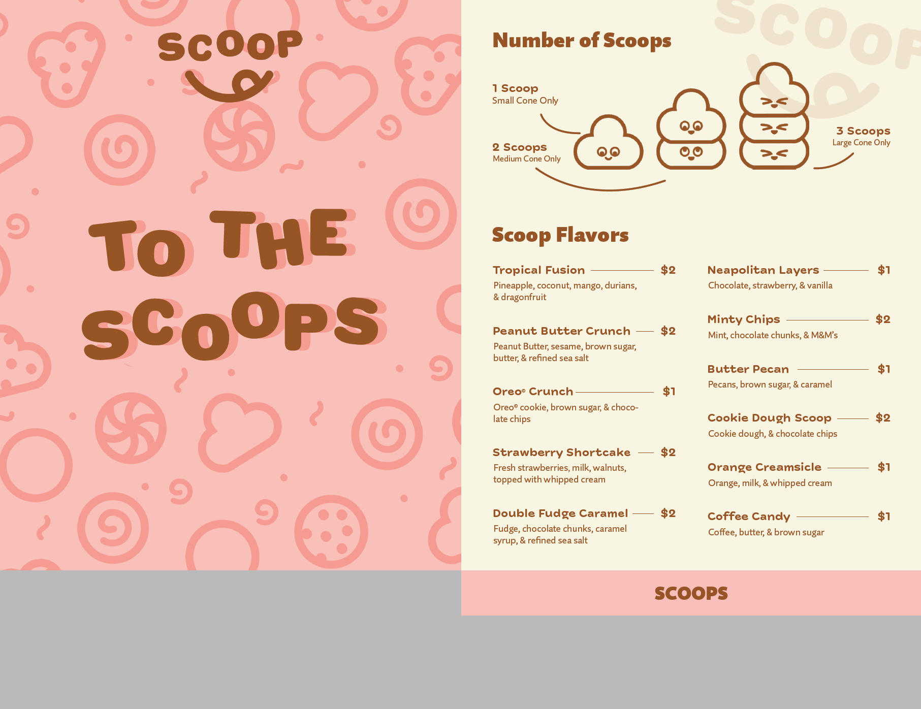
Final Menu Spread Designs
Conclusion
It was my first time fully creating a menu from concept to completion. It was very rewarding to see the real, functional menu in my hands.
I was unfamiliar with how to print it double-sided, so I printed them single-sided and used spray glue and glued the two sides together... I also didn't have the equipment to trim the menu and had to manually do it which led to small imperfections. I also couldn't saddle-stitch since this menu was created during Zoom online classes, so I had to use a stapler.
Although the creation process was more challenging than expected, this is one of my favorite pieces because of the visual and functional concept. Looking back, I definitely can improve it more, and might make a V2 someday!
